WordPress is licensed under GPLv2 (GNU General Public License) which makes it free and open-source software. Each copy of WordPress has a license copy with it.
Predecessor version of WordPress b2/cafelog was also licensed under the GPLv2.
GPL is very popular in licensing open-source software under it. It allows free installation, modification and distribution of its source-code to others. Although, it maintains some rules and regulations under it.
Here free is referred to freedom and not price. It may apply some minimal charges on certain stages.
What is GPL
GNU software was written by Richard Stallman.
The GNU General Public License is called GPL in short. It has some terms and conditions to copy, modify and distribute the software licensed under its name.
GNU makes sure that any software source-code licensed under it has to make originating source code open and freely available to all its users. Here, freely doesn’t mean by cost but it means that it is freely available to users to distribute and modify the code, but they can’t impose any restrictions on further distribution, source code has to be made available.
Software allowing these facilities comes under the category of Free Software. And if those rights need to be retained, then these are called Copylefted. The GPL demands both.
On 29th June 2007, the third version GNU GPLv3 (version 3) was released. It was discovered to deal with some problems that were present in the second version.
There are many reasons to use WordPress in today’s scenario as it provides a great help to its users in all respect.
Creating a website without logical skill
The most interesting and best part about WordPress is that anyone can create his/her own website on this without any coding or designing skills. Out of million users on WordPress, most of them are neither designers nor programmers.
To create a website on WordPress you only need an Internet connection and a web browser.
Provide a range of Themes
It gives thousand types of template options to give any type of feel and look to a website. They are very easy to customize as they come with their own option panel which allows users to select colors, background, sliders, fonts, logos and many more.
Plugins to add functionality
It provides both free and premium types of plugins. These plugins add extra functionality or may give a whole new platform to a website. It allows a user to add photo galleries, shopping carts and much more.
WordPress is a free and open-source software. It is free to install and use. As a new user you can easily create a website of your own that too absolutely free. It never has any type of hidden charges once a user started using it.
Being an open-source, you can alter the source-code according to your need. Anyone can become a contributor to WordPress by answering questions, creating themes or writing plugins.
Adding a blog is very easy
WordPress came into existence with blogging and still mostly consider it as a blogging site. It provides all type of blog solutions from designing, styling to the anti spam solutions. It will meet your demands in all possible ways.
More secure
It only takes 5 minutes to install, and is really fast in updating for security and new functionality. Upgrading to a new version is automatic and very fast as it provides a one link click upgradation. It constantly updates its site and software to prevent from hacking.
Google and WordPress
In a press conference in 2009, Matt Cutts, the head of Google’s web spam team said that “Google loves WordPress”. Even WordPress simple plugins and themes are also really attractive to Google. WordPress is a better option when doing SEO due to its framework which is easy to crawl.
Inserting Multimedia
A user whether writing a blog or creating a website, need to insert videos, pictures to make its content more powerful. WordPress makes it very easy to upload a multimedia file or to make some editing in files like images.
Mobile-Friendly
A website needs to be responsive for small screens like tablets, smartphones to reach all its users. WordPress is mobile-friendly as its themes are made responsive.
Easy to use
WordPress dashboard always look the same. You don’t need to hire an expert to learn how to use WordPress.
Till now many versions of WordPress has launched. Some of them are older versions, some are older but still supported, some are latest and some are still not launched.
The name of WordPress versions are kept on the United States musicians name.
Older Versions
Version
Released date
Musician
Purpose
0.7
May 27, 2003
none
Numbering is continued with last release of b2
1.0
Jan 3, 2004
Davis
Additions of search engine friendly links
1.2
May 22, 2004
Mingus
Plugin support added
1.5
Feb 17, 2005
Strayhorn
Added features to manage static page and theme system
2.0
Dec 31, 2005
Duke
Added features like rich editing, faster posting, image uploading and many more
2.1
Jan 22, 2007
Ella
Redesigned interface, corrected security issues, improved editing tools and content management system
2.2
May 16, 2007
Getz
Widget support for templates were added
2.3
Sept 24, 2007
Dexter
Some security fixes, added native tagging support and brought easy notification of updates
2.5
Mar 29, 2008
Brecker
Improved systems like plugin, editor, multi-file upload, extended search
2.6
Jul 15, 2008
Tyner
Made WordPress as more powerful CMS, enables track changes to every post and page and allows posting from anywhere
The b2/cafelog, a blogging tool was launched in 2001 by a French programmer Michel Valdrighi.
The programming language used to develop b2 was PHP along with MySQL. It was specifically designed to write blogs.
The major innovation in b2 was generating a page dynamically from the contents of MySQL database instead of static web pages.
It also made use of MySQL for database which provides a search option among the blogs present in the database.
It was licensed under GPL which made its source-code open for all.
It was an unmaintained site. He worked on b2 till December 2002, and suddenly vanished. All the b2 users community was concerned about the developing work of b2.
Michel reappeared in 2003 and later joined WordPress as a contributing developer.
Birth of WordPress
WordPress is the successor and fork (copy of source code) of b2/cafelog founded by Mike Little and Matt Mullenweg. It is also written in PHP language with MySQL.
Matt Mullenweg, son of a software engineer, was a user community member of b2. In 2002, he was a college student when installed b2 for his personnel use.
When Michel Valdrighi stopped updating b2, then Matt decided to fork the b2 software to do his blogging. He wrote a blog announcing to fork b2 source-code, and got a reply from Mike Little stating that he is also interested in forking and would like to work with him.
On 1st April 2003, they created a less than 10 member team to create their own version.
WordPress name
The name WordPress was suggested by a friend of Matt Mullenweg, Christine Selleck Tremoulet.
The name was completely her idea.
Releasing WordPress
After thousands of commits to the official SVN repository, WordPress first version 0.7 was released on May 27, 2003.
Next version 0.1 was released in January 2004 which is also called Davis version. Name Davis was given by Matt as he has affection towards jazz. From now on, all the updates are named on jazz.
Matt also used to include a plugin called Hello Dolly, in every release. This name is a tribute to Louis Armstrong.
AD
After few months of announcing work on b2, some other developers also forked b2. They were, b2evolution by Francois planque from France and b2++ by Donncha O Caoimh from Ireland.
Due to various forks Michel decided to make WordPress the official branch of b2. On 29th May 2003, Matt invited both b2++ and b2evolution to join hands with WordPress. Donncha of b2++ joined readily but other one didn’t.
WordPress in current scenario
WordPress is expanding day by day. It is adding some more features in its each version.
Currently it is the largest self-hosted blogging tool in the world with millions of users every day. According to a survey, WordPress encounters 22.5% of all websites on the Internet. Today these millions of users who may be developer, writer, blogger or designer make a living out of it.
WordPress yet doesn’t provide best use for mobile users. Currently, very few large enterprises use WordPress as their CMS. This number is gradually increasing day by day.
All in all, we can say that future of WordPress is very bright. Matt himself said that he envisioned WordPress as the leading Operating System in coming years.
WordPress is a free and open-source Content Management System (CMS). It is an online site based on PHP and MySQL. It was mainly designed as a blogging tool but now it has evolved into a versatile CMS. Where, you can use it to create a simple blog as well as a fully operationable website and mobile applications. It is even used to create an online store using some WordPress plugins.
But some people still misunderstand it just as a blogging platform.
It is considered as the easiest and most popular CMS tool due to its features. The main feature of WordPress is its versatility and feasibility to use. There is no use of coding and designing skills for creating a website on this. Even a non-technical person can also create a website with the help of WordPress easily.
WordPress is an open-source community that implies thousands of people from all over the world work on it. It is free software. You are free to download, install, modify and use it. Although, there might be some cost involved during web hosting.
There are more than 26,000 themes and 31,000 plugins to create a website.
WordPress tutorial provides basic and advanced concepts of WordPress. Our WordPress tutorial is designed for beginners and professionals.
WordPress is an open-source CMS (Content Management System) which is based on PHP and MySQL.
Our WordPress tutorial includes all topics of WordPress such as installation, creating WordPress site, working on WordPress dashboard, creating and editing posts, pages and comments, working with themes and plugins, WordPress security, how to backup WordPress, optimizing WordPress performance etc.
The toast component is newly introduced in Bootstrap 4. They are lightweight notifications similar to push notifications that are shown by web browsers on computer screens. They’re built with flexbox, so you can easily align and position them on a web page.
Additionally, toasts are opt-in for performance reasons, so you must initialize them yourself with toast() method. Also, toasts will automatically hide after 5000 milliseconds (5 seconds), if you do not specify autohide: false option. Now let’s see how to create a toast.
Step 1: Adding the Toast Markup
Toasts markups are pretty straightforward. The following example will show you how to create a toast component with a header, body, and a close button.
<div class="toast" id="myToast">
    <div class="toast-header">
        <strong class="me-auto"><i class="bi-gift-fill"></i> We miss you!</strong>
        <small>10 mins ago</small>
        <button type="button" class="btn-close" data-bs-dismiss="toast"></button>
    </div>
    <div class="toast-body">
        It's been a long time since you visited us. We've something special for you. <a href="#">Click here!</a>
    </div>
</div>
Step 2: Triggering the Toasts
Toasts can be triggered via JavaScript — just call the toast() Bootstrap method with the id, class or any CSS selector of the target element in your JavaScript code.
<div class="toast bg-primary text-white fade show">
    <div class="toast-header bg-primary text-white">
        <strong class="me-auto"><i class="bi-gift-fill"></i> We miss you!</strong>
        <small>10 mins ago</small>
        <button type="button" class="btn-close btn-close-white" data-bs-dismiss="toast"></button>
    </div>
    <div class="toast-body">
        It's been a long time since you visited us. We've something special for you. <a href="#" class="text-white">Click here!</a>
    </div>
</div>
— The output of the above example will look something like this:
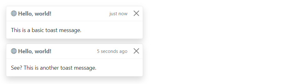
Stacking Toasts Vertically
You can stack multiple toasts vertically by simply wrapping them in a toast container, which will vertically add some spacing. Let’s take a look at the following example:
<div class="toast-container">
    <div class="toast fade show">
        <div class="toast-header">
            <strong class="me-auto"><i class="bi-globe"></i> Hello, world!</strong>
            <small>just now</small>
            <button type="button" class="btn-close" data-bs-dismiss="toast"></button>
        </div>
        <div class="toast-body">
            This is a basic toast message.
        </div>
    </div>

    <div class="toast fade show">
        <div class="toast-header">
            <strong class="me-auto"><i class="bi-globe"></i> Hello, world!</strong>
            <small>5 seconds ago</small>
            <button type="button" class="btn-close" data-bs-dismiss="toast"></button>
        </div>
        <div class="toast-body">
            See? This is another toast message.
        </div>
    </div>
</div>
— The output of the above example will look something like this:
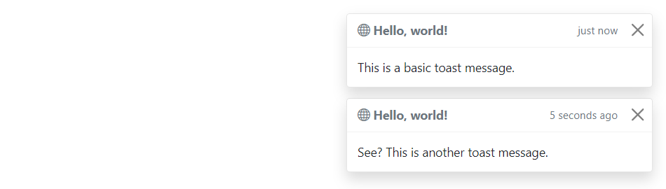
Placement of Toasts
You can place toasts anywhere on your web page using custom CSS positioning. However, the top right, bottom right, or top middle side is recommended for notifications.
Also, if you only want to show one toast at a time, put the positioning styles inline (i.e. directly on the .toast element). Let’s try out an example and see how it works:
— The output of the above example will look something like this:
Options
There are certain options which can be passed to toast() Bootstrap method to customize the functionality of a toast. Options can be passed via data attributes or JavaScript.
For setting the toast options via data attributes, just append the option name to data-bs-, such as data-bs-autohide="false", data-bs-delay="3000", etc.
Name
Type
Default Value
Description
animation
boolean
true
Apply a CSS fade transition to the toast.
autohide
boolean
true
Auto hide the toast.
delay
number
5000
Delay hiding the toast (ms).
Data attributes provides an easy way for setting the toast options, however JavaScript is the more preferable way as it prevents you from repetitive work. See the passing options examples in the methods section below to know how to set the options for toasts using JavaScript.
In the following example we’ve set the autohide option to false using the data attribute (line no-1) which prevents the toast from closing automatically.
<div class="toast" id="myToast" data-bs-autohide="false">
    <div class="toast-header">
        <strong class="me-auto"><i class="bi-gift-fill"></i> We miss you!</strong>
        <small>10 mins ago</small>
        <button type="button" class="btn-close" data-bs-dismiss="toast"></button>
    </div>
    <div class="toast-body">
        It's been a long time since you visited us. We've something special for you. <a href="#">Click here!</a>
    </div>
</div>
Methods
These are the standard bootstrap’s toast methods:
Passing options
You can additionally pass options to the toast using options object.
The following example code will prevent the toast from closing automatically.
This is a static method which allows you to get the toast instance associated with a DOM element, or create a new one in case if the toast wasn’t initialized.
Tip: Static methods cannot be called on instances of the class (i.e. objects). They’re called on the class itself. The keyword static is used to define a static method for a class.
Events
Bootstrap’s modal class includes few events for hooking into modal functionality.
Event
Description
show.bs.toast
This event fires immediately when the show instance method is called.
shown.bs.toast
This event is fired when the toast has been made visible to the user. It will wait until the CSS transition process has been fully completed before getting fired.
hide.bs.toast
This event is fired immediately when the hide instance method has been called.
hidden.bs.toast
This event is fired when the toast has finished being hidden from the user. It will wait until the CSS transition process has been fully completed before getting fired.
The following example will display an alert message to the user when the fade out transition of the toast has been fully completed. Let’s try it out and see how it works:
The Bootstrap scrollspy is a navigation mechanism that automatically highlights the nav links based on the scroll position to indicate the visitor where they are currently on the page.
The scrollspy will make your web page more elegant and accessible, if you’re using the bookmark links for directing the visitors to the different sections of a page that has a huge amount of content.
Scrollspy has the following requirements to function properly:
It must be used on a Bootstrap nav, or list group component.
You must apply the style position: relative; on the element you’re spying on, which is usually the <body> element. But, if you’re spying a <div> or any element other than the <body> be sure to additionally apply a height and overflow-y: scroll; on it.
Anchors (<a>) are required and must point to an element with that id.
Here’s an example of a scrollspy using the list group. Let’s try it out and see how it works:
You can easily add scrollspy behavior to your navbar via data attributes without writing a single line of JavaScript code. Let’s try out the following example to see how it works:
You might be wondering what this code was all about. Well, let’s go through each part of this scrollspy example code one by one for a better understanding.
Explanation of Code
The Bootstrap scrollspy has basically two components — the target (e.g. nav or list group) and the scrollable area to spy on, which is often the <body> section.
The data-bs-spy="scroll" attribute (line no-01) is applied to the element you want to spy on, which is simply the <body> element in our case.
The data-bs-target attribute is added to the element we’re spying on (i.e. the <body> element) with the ID or class of the parent element of any Bootstrap .nav component, so that nav links can be targeted by the scrollspy for highlighting purpose.
The optional data-bs-offset attribute specifies the number of pixels to offset from top when calculating the position of scroll. Adjust the offset value if the targeted links are highlighting too early or too late. The default value is 10 pixels.
Rest of the thing is self explanatory, such as the .navbar element specifies a Bootstrap navbar, whereas the element <a href="#section1">Section 1</a> (line no-7) creates a bookmark link, the .dropdown element (line no-15) creates a dropdown menu, and so on.
Creating ScrollSpy via JavaScript
You may also add scrollspy manually using the JavaScript — just call the scrollspy() Bootstrap method with the id or classselector of the navbar in your JavaScript code.
There are certain options which may be passed to scrollspy() Bootstrap method to customize the functionality of a scrollspy. Options can be passed via data attributes or JavaScript.
For setting the scrollspy options via data attributes, just append the option name to data-bs-, like data-bs-offset="0", data-bs-method="position", and so on.
Name
Type
Default Value
Description
offset
number
10
Number of pixels to offset from top when calculating position of scroll.
method
string
auto
Finds which section the spied element is in. The value auto will choose the best method get scroll coordinates.Whereas, the value offset will use jQuery offset method to get scroll coordinates, and the value position will use jQuery position method to get scroll coordinates.
target
string | jQuery object | DOM element
Specifies element to apply Scrollspy plugin.
Methods
These are the standard bootstrap’s scrollspy methods:
Passing options
You can additionally pass options to the scrollspy using options object.
The following example will set offset from top when calculating scroll position.
You’ll need to call this method when you’re using scrollspy in conjunction with adding or removing elements from the DOM. Let’s try out an example and see how it really works:
This is a static method which allows you to get the scrollspy instance associated with a DOM element, or create a new one in case if the scrollspy wasn’t initialized.
The typeahead input fields are very popular in modern web forms. The main purpose of using typeahead is to improve the user experience by supplying hints or a list of possible choices based on the text they’ve entered while filling a form or searching something — like the Google instant search.
Typeahead functionality also saves time and reduces the number of potential errors, because the user has less likelihood of making a spelling mistake. Typeahead plugin has been dropped from the Bootstrap (v3.0+), in favor of using Twitter typeahead.
Twitter typeaheads is a fast and fully-featured autocomplete library inspired by twitter.com’s autocomplete search functionality. To create Twitter typeaheads first download typeahead.js from their official page — https://twitter.github.io/typeahead.js/ and include in your project, after that you can turn any text-based <input> element into a typeahead.
Twitter typeaheads require jQuery 1.9+ to work. Non-jQuery version is not available.
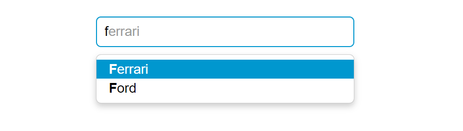
Creating Twitter Typeahead with Local Dataset
The following example will show you how to create Twitter typeahead with local dataset.
<script>
$(document).ready(function(){
    // Defining the local dataset
    var cars = ['Audi', 'BMW', 'Bugatti', 'Ferrari', 'Ford', 'Lamborghini', 'Mercedes Benz', 'Porsche', 'Rolls-Royce', 'Volkswagen'];

    // Constructing the suggestion engine
    var cars = new Bloodhound({
        datumTokenizer: Bloodhound.tokenizers.whitespace,
        queryTokenizer: Bloodhound.tokenizers.whitespace,
        local: cars
    });

    // Initializing the typeahead
    $('.typeahead').typeahead({
        hint: true,
        highlight: true, /* Enable substring highlighting */
        minLength: 1 /* Specify minimum characters required for showing suggestions */
    },
    {
        name: 'cars',
        source: cars
    });
});
</script>
— The output of the above example will look something like this:
Note: Bloodhound is the typeahead.js suggestion engine. It is very flexible and offers advanced functionalities such as prefetching remote data, fast lookups through intelligent caching using the browser local storage, etc.
Tip: Set autocomplete="off" for the input box if you want to prevent default browser menus from appearing over the Bootstrap type-ahead dropdown.
Creating Twitter Typeahead External Dataset
You can also specify external dataset through a URL pointing to a JSON file containing an array of datums. The individual units that compose datasets are called datums.
<script>
$(document).ready(function(){
    // Sonstructs the suggestion engine
    var countries = new Bloodhound({
        datumTokenizer: Bloodhound.tokenizers.whitespace,
        queryTokenizer: Bloodhound.tokenizers.whitespace,
        // The url points to a json file that contains an array of country names
        prefetch: 'data/countries.json'
    });

    // Initializing the typeahead with remote dataset without highlighting
    $('.typeahead').typeahead(null, {
        name: 'countries',
        source: countries,
        limit: 10 /* Specify max number of suggestions to be displayed */
    });
});
</script>
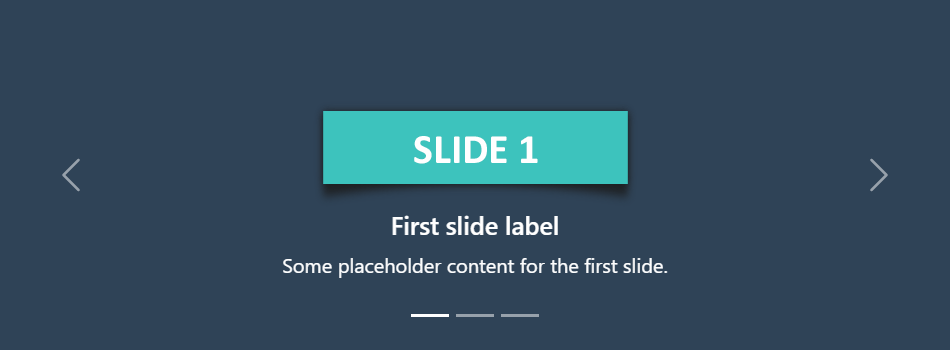
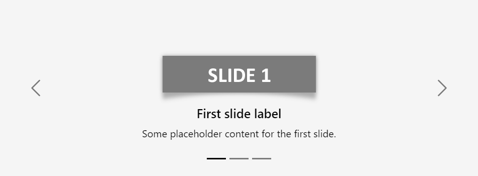
The carousel also known as slideshow or image slider is some of the best way of showcasing the huge amount of contents within a small space on the web pages. It is a dynamic presentation of contents where text and images are made visible or accessible to the user by cycling through several items.
The following example will show you how to build a simple carousel or slideshow with previous/next controls and indicators using the Bootstrap carousel plugin.
— The output of the above example will look something like this:
Creating Carousel with Captions
You can also add captions to carousel slides easily with the .carousel-caption element within any .carousel-item. You can optionally use display utility classes to hide captions on smaller viewports.
Let’s try out the following example to understand how it basically works:
— The output of the above example will look something like this:
Tip: The classes .d-none and .d-md-block on the .carousel-caption elements in the example above makes the carousel captions visible on the medium devices (i.e. viewport width ≥768px), but hide them on the smaller viewports.
Creating Dark Variant of Carousel
You can additionally add .carousel-dark to the .carousel to create darker controls, indicators, and captions in case your slides are lighter in color. Let’s check out an example:
You can also add captions such as heading or description text to the individual slides of the carousel, please check out the next example in the following section.
Activate Carousels via Data Attributes
With Bootstrap you can create carousels very easily via data attributes without writing a single line of JavaScript code. Let’s take a look at the following example:
You might be wondering what this code was all about. Well, let’s go through each part of this carousel example code one by one for a better understanding.
Explanation of Code
The Bootstrap carousel generally has three components — carousel indicators (small rectangles), carousel controls (previous and next arrows) and the carousel items or slides.
The outermost container of every carousel (i.e. the .carousel element) requires a unique id (in our case id="myCarousel") so that it can be targeted by the carousel indicators (line no-4,5,6) and carousel controls (line no-23,26) to function properly.
The data-bs-ride="carousel" attribute of the .carousel element tells the Bootstrap to start animating the carousel immediately when the page load.
The data-bs-slide-to attribute (line no-4,5,6) move the slide position to a particular item (index beginning with 0) when clicking on the specific carousel indicator.
The slides are specified within the .carousel-inner (line no-10) and the content of each slide is defined within the .carousel-item element that can be text and images.
The data-bs-slide attribute on carousel controls (line no-23,26) accepts the keywords prev or next, which alters the slide position relative to its current position.
Rest of the thing is self-explanatory, for example, the .carousel element specifies the Bootstrap carousel, the .carousel-indicators element indicates how many slides are there in the carousel and which slide is currently active, .carousel-control-prev, .carousel-control-next elements defines previous and next controls to move between carousel slides, and so on.
Tip: It is required to add the class .active to one of the carousel slides (i.e. on the .carousel-item element), otherwise carousel will not be visible.
Note: The .slide class on the .carousel element adds CSS slide transition animation to the carousel that makes the carousel items slide when showing the new item.
Activate Carousels via JavaScript
You may also activate a carousel manually using the JavaScript — just call the carousel() method with the id or classselector of the wrapper element in your JavaScript code.
Tip: Manually activating a carousel via JavaScript can be helpful in a situation when you don’t want your carousel to start sliding or animating at page load.
Options
There are certain options which can be passed to carousel() Bootstrap method to customize the functionality of a carousel. Options can be passed via data attributes or JavaScript.
For setting the modals options via data attributes, just append the option name to data-bs, such as data-bs-interval="3000", data-bs-pause="hover", and so on.
Name
Type
Default Value
Description
interval
number
5000
Specifies the amount of time to delay (in milliseconds) between one slide to another in automatic cycling. If false, carousel will not automatically cycle.
keyboard
boolean
true
Specifies whether the carousel should react to keyboard events. By default it is true that means if carousel has focus you can go to its previous and next slide using the left and right arrow keys on the keyboard.
pause
string | boolean
‘hover’
Pauses the cycling of the carousel when mouse pointer enters the carousel and resumes the cycling when mouse pointer leaves the carousel, by default. If set to false, hovering over the carousel won’t pause it.
ride
string | boolean
false
Autoplays the carousel after the user manually cycles the first item. If set to 'carousel', autoplays the carousel on load.
wrap
boolean
true
Specifies whether the carousel should cycle continuously or have hard stops (i.e stop at the last slide).
touch
boolean
true
Specifies whether the carousel should support left/right swipe interactions on touchscreen devices.
Data attributes provides an easy way for setting the carousel options, however JavaScript is the more preferable way as it prevents you from repetitive work. See the passing options section below to know how to set the options for carousels using JavaScript.
Methods
These are the standard bootstrap’s carousels methods:
Passing options
You can additionally pass options to the carousels using options object.
The following example will turn off auto sliding in the carousel. By default Bootstrap carousel is started playing or sliding automatically when the page loads.
This is a static method which allows you to get the carousel instance associated with a DOM element, or create a new one in case if the carousel wasn’t initialized.
Bootstrap’s carousel class includes few events for hooking into carousel functionality.
Event
Description
slide.bs.carousel
This event fires immediately when the slide instance method is called.
slid.bs.carousel
This event is fired when the carousel has completed its slide transition.
The following example displays an alert message when sliding transition of a carousel item has been fully completed. Let’s try it out and see how it actually works.