In the previous section you’ve learnt about the Bootstrap button styling and the modifications as well as how to create button groups and toolbars. With Bootstrap you can do even more with the buttons like controlling the states of buttons, make checkbox and radio inputs behaves like toggle buttons, and so on. In the following section we will discuss them in detail.
Creating Single Toggle Button
You can activate toggling (i.e. change the normal state of a button to a push state and vice versa) on a single button by simply adding the data attribute data-bs-toggle="button".
If you’re pre-toggling a button, you must add the .active class manually.
— The toggle button upon clicking will look something like this:
Note: The Mozilla Firefox browser persists the button state across page loads, to prevent this behavior, you may simply set the attribute autocomplete="off" on the form containing the buttons, or directly to the input or button element.
Creating Checkbox Button Groups
You can also combine checkboxes to create checkbox style toggling on button groups. Let’s try out the following example to understand how it basically works:
— The output of the above example will look something like this:
Note: Don’t use the .active class to preselect checkbox or radio in button groups, as it only changes the visual appearance to make them look like selected. To actually preselect them you will need to apply the checked attribute on the input element yourself.
Creating Radio Button Groups
Similarly, you can create radio buttons style toggling on button groups, like this:
— The output of the above example will look something like this:
Methods
These are the standard bootstrap’s buttons methods:
toggle
This method toggles push state of the button. It changes the appearance of the button, and makes it look like that it has been activated. You can also enable auto toggling of a button by simply using the data-bs-toggle="button" attribute. Let’s take a look at the following example:
This is a static method which allows you to get the button instance associated with a DOM element, or create a new one in case if the button wasn’t initialized.
Alert boxes are used quite often to stand out the information that requires immediate attention of the end users such as warning, error or confirmation messages.
With Bootstrap you can easily create elegant alert messages for various purposes by adding the contextual classes (e.g., .alert-success, .alert-warning, .alert-info etc.) to the .alert base class. You can also add an optional close button to dismiss any alert.
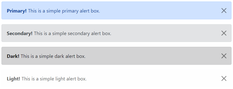
Bootstrap provides total 8 different types of alerts. The following example will show you the most commonly used alerts, which are: success, error or danger, warning and info alerts.
<!-- Primary Alert -->
<div class="alert alert-primary alert-dismissible fade show">
    <strong>Primary!</strong> This is a simple primary alert box.
    <button type="button" class="btn-close" data-bs-dismiss="alert"></button>
</div>

<!-- Secondary Alert -->
<div class="alert alert-secondary alert-dismissible fade show">
    <strong>Secondary!</strong> This is a simple secondary alert box.
    <button type="button" class="btn-close" data-bs-dismiss="alert"></button>
</div>

<!-- Dark Alert -->
<div class="alert alert-dark alert-dismissible fade show">
    <strong>Dark!</strong> This is a simple dark alert box.
    <button type="button" class="btn-close" data-bs-dismiss="alert"></button>
</div>

<!-- Light Alert -->
<div class="alert alert-light alert-dismissible fade show">
    <strong>Light!</strong> This is a simple light alert box.
    <button type="button" class="btn-close" data-bs-dismiss="alert"></button>
</div>
— The output of the above example will look something like this:
Tip: The .fade and .show classes on the .alert element enable the fading transition effect while closing the alert boxes. If you don’t want animation just removes these classes. Also, the class .alert-dismissible is required on the .alert element for proper positioning of the .btn-close. If your alert doesn’t have a close button you can skip this class.
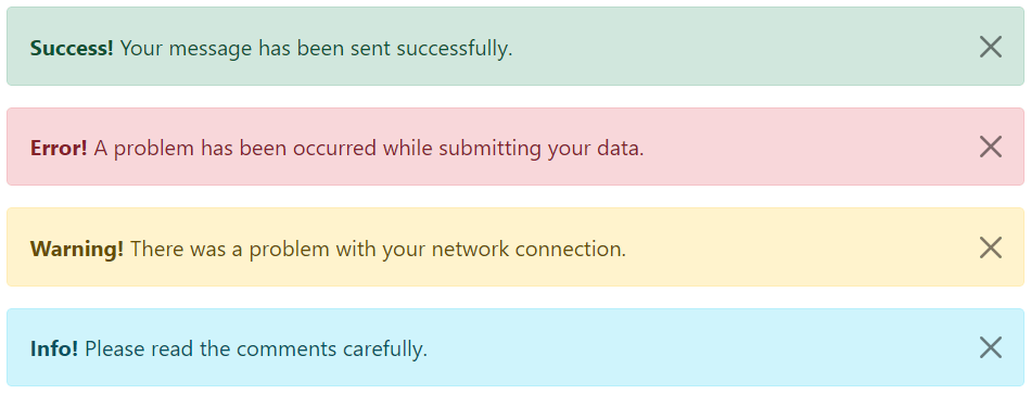
Adding Icons to Bootstrap Alerts
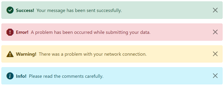
You can also place icons inside Bootstrap alerts. You can either use Bootstrap icons or third-party icons like Font Awesome. Let’s take a look at the following example:
<!-- Success Alert -->
<div class="alert alert-success alert-dismissible d-flex align-items-center fade show">
    <i class="bi-check-circle-fill"></i>
    <strong class="mx-2">Success!</strong> Your message has been sent successfully.
    <button type="button" class="btn-close" data-bs-dismiss="alert"></button>
</div>

<!-- Error Alert -->
<div class="alert alert-danger alert-dismissible d-flex align-items-center fade show">
    <i class="bi-exclamation-octagon-fill"></i>
    <strong class="mx-2">Error!</strong> A problem has been occurred while submitting your data.
    <button type="button" class="btn-close" data-bs-dismiss="alert"></button>
</div>

<!-- Warning Alert -->
<div class="alert alert-warning alert-dismissible d-flex align-items-center fade show">
    <i class="bi-exclamation-triangle-fill"></i>
    <strong class="mx-2">Warning!</strong> There was a problem with your network connection.
    <button type="button" class="btn-close" data-bs-dismiss="alert"></button>
</div>

<!-- Info Alert -->
<div class="alert alert-info alert-dismissible d-flex align-items-center fade show">
    <i class="bi-info-circle-fill"></i>
    <strong class="mx-2">Info!</strong> Please read the comments carefully.
    <button type="button" class="btn-close" data-bs-dismiss="alert"></button>
</div>
— The output of the above example will look something like this:
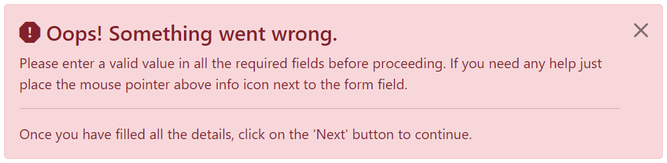
Additional Content inside Alerts
You can also place additional HTML elements like headings, paragraphs and dividers inside an alert. To manage spacing between the elements you can use margin utility classes, as here:
<div class="alert alert-danger alert-dismissible fade show">
    <h4 class="alert-heading"><i class="bi-exclamation-octagon-fill"></i> Oops! Something went wrong.</h4>
    <p>Please enter a valid value in all the required fields before proceeding. If you need any help just place the mouse pointer above info icon next to the form field.</p>
    <hr>
    <p class="mb-0">Once you have filled all the details, click on the 'Next' button to continue.</p>
    <button type="button" class="btn-close" data-bs-dismiss="alert"></button>
</div>
— The output of the above example will look something like this:
Matching Links Color inside Alerts
You can apply the utility class .alert-link to the links inside any alert boxes to quickly create matching colored links, as shown in the example below:
<!-- Success Alert -->
<div class="alert alert-success alert-dismissible fade show">
<strong>Success!</strong> A simple success alert with <a href="#" class="alert-link">an example link</a>.
<button type="button" class="btn-close" data-bs-dismiss="alert"></button>
</div>
<!-- Error Alert -->
<div class="alert alert-danger alert-dismissible fade show">
<strong>Error!</strong> A simple danger alert with <a href="#" class="alert-link">an example link</a>.
<button type="button" class="btn-close" data-bs-dismiss="alert"></button>
</div>
<!-- Warning Alert -->
<div class="alert alert-warning alert-dismissible fade show">
    <strong>Warning!</strong> A simple warning alert with <a href="#" class="alert-link">an example link</a>.
    <button type="button" class="btn-close" data-bs-dismiss="alert"></button>
</div>
<!-- Info Alert -->
<div class="alert alert-info alert-dismissible fade show">
<strong>Info!</strong> A simple info alert with <a href="#" class="alert-link">an example link</a>.
<button type="button" class="btn-close" data-bs-dismiss="alert"></button>
</div>
<!-- Primary Alert -->
<div class="alert alert-primary alert-dismissible fade show">
<strong>Primary!</strong> A simple primary alert with <a href="#" class="alert-link">an example link</a>.
<button type="button" class="btn-close" data-bs-dismiss="alert"></button>
</div>
<!-- Secondary Alert -->
<div class="alert alert-secondary alert-dismissible fade show">
<strong>Secondary!</strong> A simple secondary alert with <a href="#" class="alert-link">an example link</a>.
<button type="button" class="btn-close" data-bs-dismiss="alert"></button>
</div>
<!-- Dark Alert -->
<div class="alert alert-dark alert-dismissible fade show">
<strong>Dark!</strong> A simple dark alert with <a href="#" class="alert-link">an example link</a>.
<button type="button" class="btn-close" data-bs-dismiss="alert"></button>
</div>
<!-- Light Alert -->
<div class="alert alert-light alert-dismissible fade show">
<strong>Light!</strong> A simple light alert with <a href="#" class="alert-link">an example link</a>.
<button type="button" class="btn-close" data-bs-dismiss="alert"></button>
</div>
Closing Alerts via Data Attribute
Data attributes provides a simple and easy way to add close functionality to the alert boxes.
Just add the data-bs-dismiss="alert" to the close button and it will automatically enable the dismissal of the containing alert message box. Also, add the class .alert-dismissible to the .alert element for proper positioning of the .btn-close button.
<div class="alert alert-info alert-dismissible fade show">
    <strong>Note!</strong> This is a simple example of dismissible alert.
    <button type="button" class="btn-close" data-bs-dismiss="alert"></button>
</div>
Use the <button> element for creating the close button for consistent behavior across all devices.
Closing Alerts via JavaScript
You may also dismiss an alert via JavaScript. Let’s try out an example and see how it works:
These are the standard bootstrap’s alerts methods:
close
This method closes an alert by removing it from the DOM. If the .fade and .show classes are present on the element, the alert will fade out before it is removed.
<script>
$(document).ready(function(){
    // Create alert instance
    $("#myAlert").alert();

    // Get alert instance on button click
    $("#myBtn").click(function(){
        var myAlert = bootstrap.Alert.getInstance($("#myAlert")[0]);
        console.log(myAlert);
        // {_element: div#myAlert.alert.alert-info.alert-dismissible.fade.show}
    });
});
</script>
getOrCreateInstance
This is a static method which allows you to get the alert instance associated with a DOM element, or create a new one in case if the alert wasn’t initialized.
Popover is a small overlay of content that is used to display secondary information of any element when it is clicked by a user, like those on the iPad.
Step 1: Adding the Popover Markup
To create a popover, you need to add the data-bs-toggle="popover" attribute to an element. Whereas, popover’s title and its content that would display upon trigger or activation can be specified using the title and data-bs-content attribute respectively.
Here is the standard markup for adding a popover to a button.
<button type=”button” data-bs-toggle=”popover” title=”Popover title” data-bs-content=”Here’s some amazing content.”>Click to toggle popover</button>
Similarly, you can add popovers to the other elements such as links, icons, etc.
Note: For performance reasons the popovers data-apis are opt in like tooltips, means to use popovers you must initialize them yourself. Also, popovers with zero-length title and content values are never displayed, as well as triggering popovers on hidden elements will not work.
Step 2: Enabling the Popovers
Popovers can be triggered via JavaScript — just call the popover() Bootstrap method with the id, class or any CSS selector of the required element in your JavaScript code.
You can either initialize popovers individually or all in one go. The following example code will initialize all popovers on the page by selecting them by their data-bs-toggle attribute.
By default popovers are not hiding until you click the trigger element once again. You can use the focus trigger to hide the popovers when the user makes the next click.
Note: To make this feature work properly across the browsers, you must use the <a> tag, not the <button> tag, and you also must include a tabindex attribute.
Options
There are certain options which may be passed to popover() Bootstrap method to customize the functionality of the popover plugin.
Name
Type
Default Value
Description
animation
boolean
true
Apply a CSS fade transition to the popover.
container
string | element | false
false
Appends the popover to a specific element.Specify container: 'body' to avoid rendering problems in more complex components (like input groups, button groups, etc.)
content
string | element | function
”
Sets default content value if data-bs-content attribute isn’t present.
delay
number | object
0
Time to delay in showing and hiding the popover (ms) — does not apply to manual trigger type.If a number is supplied, delay is applied to both hide/showObject structure is: delay: { "show": 500, "hide": 100 }
html
boolean
false
Insert HTML into the popover.If false, innerText property will be used to insert content into the DOM.Use simple text if you’re worried about XSS attacks.
placement
string | function
‘right’
Sets the position of the popover — auto | top | bottom | left | right.When auto value is specified, it will dynamically reorient the popover.
selector
string | false
false
If a selector is provided, popover objects will be attached to the specified targets.This is normally used to apply popovers to dynamically added DOM elements.
Base HTML to use when creating the popover.The popover’s title will be inserted into the .popover-header element.The popover’s content will be inserted into the .popover-body element.The .popover-arrow element will become the popover’s arrow.The outermost wrapper element should have the .popover class.
title
string | element | function
”
Sets the default title value if title attribute isn’t present.
trigger
string
‘click’
Specify how popover is triggered — click | hover | focus | manual. You can pass multiple triggers; separated with a space.The value manual indicates that the popover will be triggered programmatically via the .show(), .hide() and .toggle() methods; this value cannot be combined with any other trigger.
fallbackPlacements
array
[‘top’, ‘right’, ‘bottom’, ‘left’]
Allows you to specify which placement Popper will use on fallback.
boundary
string | element
‘clippingParents’
Overflow constraint boundary of the popover (applies only to Popper’s preventOverflow modifier). It can also accept an HTMLElement reference (via JavaScript only).
customClass
string | function
”
Add classes to the popover when it is shown. Please note that these classes will be added in addition to any classes specified in the template. To add multiple classes, separate them with spaces like: 'class1 class2'.You can also pass a function that should return a single string containing additional class names.
sanitize
boolean
true
Enable or disable the sanitization. If activated 'template', 'content' and 'title' options will be sanitized.
You can set these options either through the use of data attributes or JavaScript. For setting the popovers options via data attributes, just append the option name to data-bs- along with the correct value, like data-bs-animation="false", data-bs-placement="top" etc.
Also, when passing the options via data attributes make sure to change the case type of the option name from camelCase to kebab-case. For example, instead of using data-bs-customClass="my-class", use data-bs-custom-class="my-class".
However, JavaScript is the preferred way of setting these options as it prevents you from repetitive work. See the passing options section below to know how to set the options for popovers via JavaScript.
Methods
These are the standard Bootstrap’s popover methods:
Passing options
You can additionally pass options to the popovers using options object.
The following example will set the title text for the popovers dynamically, if the value of the title attribute is omitted or missing from the selected elements:
<script>
$(document).ready(function(){
    $("#myPopover").popover({
        title: '<h4 class="custom-title"><i class="bi-info-circle-fill"></i> Popover info</h4>',
        content: '<p>This is a <em>simple example</em> demonstrating how to insert HTML code inside <strong>Bootstrap popover</strong>.</p>',
        html: true
    });
});
</script>
The following example will show you how to control the timing of showing and hiding the popover using the popover’s delay option dynamically via JavaScript.
<script>
$(document).ready(function(){
    // Show and hide popover with same speed
    $("#tinyPopover").popover({
        delay: 100
    });

    // Show and hide popover with different speed
    $("#largePopover").popover({
        delay: {show: 0, hide: 2000}
    });
});
</script>
The following example will show you how to create your own custom template for Bootstrap popovers instead of using the default one dynamically via JavaScript.
The following example will insert the dynamically generated HTML code of the popover at the end of the #wrapper element instead of the default <body> element.
<script>
$(document).ready(function(){
    // Append popover HTML to wrapper element
    $("#myPopover").popover({
        container: "#wrapper"
    });
});
</script>
Note: Overriding the popover’s default container option value does not produce any visible difference on page. To see the actual result you need to inspect the DOM. Press Ctrl+Shift+I (Windows / Linux) or Cmd+Opt+I (Mac) to open Developer tools or DOM Inspector.
Similarly, you can set other options for the popovers. Let’s check out the other methods of the Bootstrap popover plugin.
show
This method reveals an element’s popover. This is considered a “manual” triggering of the popover.
<script>
$(document).ready(function(){
    // Trigger the popover
    $("#myPopover").popover();

    // Get popover instance on button click
    $("#myBtn").click(function(){
        var myPopover = bootstrap.Popover.getInstance($("#myPopover")[0]);
        console.log(myPopover);
        // {_element: button#myPopover.btn.btn-primary.btn-lg, _isEnabled: true, _timeout: 0, _hoverState: null, _activeTrigger: {…}, …}
    });
});
</script>
getOrCreateInstance
This is a static method which allows you to get the popover instance associated with a DOM element, or create a new one in case if the popover wasn’t initialized.
<script>
$(document).ready(function(){
    // Get or create popover instance on button click
    $("#myBtn").click(function(){
        var myPopover = bootstrap.Popover.getOrCreateInstance($("#myPopover")[0]);
        console.log(myPopover);
        // {_element: button#myPopover.btn.btn-primary.btn-lg, _isEnabled: true, _timeout: 0, _hoverState: "", _activeTrigger: {…}, …}
    });
});
</script>
Events
Bootstrap’s popover class includes few events for hooking into popover functionality.
Event
Description
show.bs.popover
This event fires immediately when the show instance method is called.
shown.bs.popover
This event is fired when the popover has been made visible to the user. It will wait until the CSS transition process has been fully completed before getting fired.
hide.bs.popover
This event is fired immediately when the hide instance method has been called.
hidden.bs.popover
This event is fired when the popover has finished being hidden from the user. It will wait until the CSS transition process has been fully completed before getting fired.
inserted.bs.popover
This event is fired after the show.bs.popover event when the popover template has been added to the DOM.
The following example will display an alert message to the user when the fade out transition of the popover has been fully completed.
<script>
$(document).ready(function(){
    // Initialize popover
    $("#myPopover").popover();

    // Show alert when the popover has finished being hidden
    $("#myPopover").on("hidden.bs.popover", function(){
        alert("Popover has been completely closed.");
    });
});
</script>
A tooltip is a small pop up that appears when user places the mouse pointer over an element such as link or buttons to provide hint or information about the element being hovered.
Tooltips can be very helpful for the new visitors of your website because they enable the user to know the purpose of icons and links by placing the mouse pointer over them.
Step 1: Adding the Tooltip Markup
To create a tooltip, you need to add the data-bs-toggle="tooltip" attribute to an element. Tolltip text that would display on hover can be specified using the title attribute.
Here is the standard markup for adding a tolltip to a hyperlink.
<a href=”#” data-bs-toggle=”tooltip” title=”Some text”>Hover over me</a>
Similarly, you can add tooltips to the other elements such as buttons, icons, etc.
Step 2: Enabling the Tooltips
Tooltips can be enabled via JavaScript — just call the tooltip() Bootstrap method with the id, class or any CSS selector of the target element in your JavaScript code.
You can either initialize tooltips individually or all in one go. The following jQuery code will initialize all tooltips on the page by selecting them by their data-bs-toggle attribute.
— The output of the above example will look something like this:
Note: For performance reasons the tooltip data-apis are opt in, means to use tooltips you must initialize them yourself. Also, tooltips with zero-length titles are never displayed, as well as triggering tooltips on hidden elements will not work.
Tip: Tooltips for .disabled or disabled elements must be triggered on a wrapper element. Also, when tooltips are triggered from hyperlinks that span multiple lines, it will be centered. You can use white-space: nowrap; on those hyperlinks to avoid this behavior.
Setting the Directions of Tooltips
You can set tooltips to appear on top, right, bottom and left sides of an element.
Positioning of Tooltips via Data Attributes
The following example will show you how to set the direction of tooltips via data attributes.
<a href="#" data-bs-toggle="tooltip" data-bs-placement="top" title="Tooltip on top">Tooltip on top</a>
<a href="#" data-bs-toggle="tooltip" data-bs-placement="right" title="Tooltip on right">Tooltip on right</a>
<a href="#" data-bs-toggle="tooltip" data-bs-placement="bottom" title="Tooltip on bottom">Tooltip on bottom</a>
<a href="#" data-bs-toggle="tooltip" data-bs-placement="left" title="Tooltip on left">Tooltip on left</a>
Positioning of Tooltips via JavaScript
The following example will show you how to set the direction of tooltips via JavaScript.
There are certain options which may be passed to tooltip() Bootstrap method to customize the functionality of the tooltip plugin.
Name
Type
Default Value
Description
animation
boolean
true
Apply a CSS fade transition to the tooltip.
container
string | element | false
false
Appends the tooltip to a specific element.Specify container: 'body' to avoid rendering problems in more complex components (like input groups, button groups, etc.)
delay
number | object
0
Time to delay in showing and hiding the tooltip (ms) — does not apply to manual trigger type.If a number is supplied, delay is applied to both hide/showObject structure is: delay: { "show": 500, "hide": 100 }
html
boolean
false
Insert HTML into the tooltip.If true, HTML tags in the tooltip’s title will be rendered in the tooltip. If false, innerText property will be used to insert content into the DOM.Use simple text if you’re worried about XSS attacks.
placement
string | function
‘top’
Sets the position of the tooltip — auto | top | bottom | left | right.When auto value is specified, it will dynamically reorient the tooltip.
selector
string | false
false
If a selector is provided, tooltip objects will be attached to the specified targets.This is normally used to apply tooltips to dynamically added DOM elements.
Base HTML to use when creating the tooltip.The tooltip’s title will be inserted into the .tooltip-inner element.The .tooltip-arrow element will become the tooltip’s arrow.The outermost wrapper element should have the .tooltip class.
title
string | element | function
”
Sets the default title value if title attribute isn’t present.
trigger
string
‘hover focus’
Specify how tooltip is triggered — click | hover | focus | manual. You can pass multiple triggers; separated with a space.The value manual indicates that the tooltip will be triggered programmatically via the .show(), .hide() and .toggle() methods; this value cannot be combined with any other trigger.
fallbackPlacements
array
[‘top’, ‘right’, ‘bottom’, ‘left’]
Allows you to specify which placement Popper will use on fallback.
boundary
string | element
‘clippingParents’
Overflow constraint boundary of the tooltip (applies only to Popper’s preventOverflow modifier). It can also accept an HTMLElement reference (via JavaScript only).
customClass
string | function
”
Add classes to the tooltip when it is shown. Please note that these classes will be added in addition to any classes specified in the template. To add multiple classes, separate them with spaces like: 'class1 class2'.You can also pass a function that should return a single string containing additional class names.
sanitize
boolean
true
Enable or disable the sanitization. If activated 'template' and 'title' options will be sanitized.
You can set these options either through the use of data attributes or JavaScript. For setting the tooltips options via data attributes, just append the option name to data-bs- along with the correct value, like data-bs-animation="false", data-bs-placement="bottom" etc.
Also, when passing the options via data attributes make sure to change the case type of the option name from camelCase to kebab-case. For example, instead of using data-bs-customClass="my-class", use data-bs-custom-class="my-class".
However, JavaScript is the preferred way of setting these options as it prevents you from repetitive work. See the passing options section below to know how to set the options for tooltips via JavaScript.
Methods
These are the standard Bootstrap’s tooltip methods:
Passing options
You can additionally pass options to the tooltips using options object.
The following example will set the title text for the tooltips dynamically, if the value of the title attribute is omitted or missing from the selected elements:
The following example will show you how to control the timing of showing and hiding the tooltip using the tooltip’s delay option dynamically via JavaScript.
<script>
$(document).ready(function(){
    // Show and hide tooltip with same speed
    $("#tinyTooltip").tooltip({
        delay: 100
    });

    // Show and hide tooltip with different speed
    $("#largeTooltip").tooltip({
        delay: {show: 0, hide: 2000}
    });
});
</script>
The following example will show you how to create your own custom template for Bootstrap tooltips instead of using the default one dynamically via JavaScript.
The following example will insert the dynamically generated HTML code of the tooltip at the end of the #wrapper element instead of the default <body> element.
<script>
$(document).ready(function(){
    // Append tooltip HTML to wrapper element
    $("#myTooltip").tooltip({
        container: "#wrapper"
    });
});
</script>
Note: Overriding the tooltip’s default container option value does not produce any visible difference on page. To see the actual result you need to inspect the DOM. Press Ctrl+Shift+I (Windows / Linux) or Cmd+Opt+I (Mac) to open Developer tools or DOM Inspector.
Similarly, you can set other options for the tooltips. Let’s check out the other methods of the Bootstrap tooltip plugin.
show
This method reveals an element’s tooltip. This is considered a “manual” triggering of the tooltip.
<script>
$(document).ready(function(){
    // Trigger the tooltip
    $("#myTooltip").tooltip();

    // Get tooltip instance on button click
    $("#myBtn").click(function(){
        var myTooltip = bootstrap.Tooltip.getInstance($("#myTooltip")[0]);
        console.log(myTooltip);
        // {_element: a#myTooltip, _isEnabled: true, _timeout: 0, _hoverState: "", _activeTrigger: {…}, …}
    });
});
</script>
getOrCreateInstance
This is a static method which allows you to get the tooltip instance associated with a DOM element, or create a new one in case if the tooltip wasn’t initialized.
<script>
$(document).ready(function(){
    // Get or create tooltip instance on button click
    $("#myBtn").click(function(){
        var myTooltip = bootstrap.Tooltip.getOrCreateInstance($("#myTooltip")[0]);
        console.log(myTooltip);
        // {_element: a#myTooltip, _isEnabled: true, _timeout: 0, _hoverState: "", _activeTrigger: {…}, …}
    });
});
</script>
Events
Bootstrap’s tooltip class includes few events for hooking into tooltip functionality.
Event
Description
show.bs.tooltip
This event fires immediately when the show instance method is called.
shown.bs.tooltip
This event is fired when the tooltip has been made visible to the user. It will wait until the CSS transition process has been fully completed before getting fired.
hide.bs.tooltip
This event is fired immediately when the hide instance method has been called.
hidden.bs.tooltip
This event is fired when the tooltip has finished being hidden from the user. It will wait until the CSS transition process has been fully completed before getting fired.
inserted.bs.tooltip
This event is fired after the show.bs.tooltip event when the tooltip template has been added to the DOM.
The following example will display an alert message to the user when the fade out transition of the tooltip has been fully completed.
You can use the Bootstrap collapse JavaScript plugin to easily show and hide (or expand and collapse) specific elements on a web page. Buttons and anchors (i.e. the <button> and <a> elements) are typically used as triggers that are mapped to the elements you want to toggle.
Expand and Collapse Elements via Data Attributes
You can show and hide elements in Bootstrap by clicking on a button or link via data attributes without writing any JavaScript code. Let’s try out an example and see how it actually works:
<!-- Trigger Buttons HTML -->
<a href="#myCollapse" data-bs-toggle="collapse">Toggle Element</a>
<button type="button" class="btn btn-primary" data-bs-toggle="collapse" data-bs-target="#myCollapse">Toggle Element</button>

<!-- Collapsible Element HTML -->
<div class="collapse show" id="myCollapse">
    <div class="card card-body">This is a simple example of showing and hiding specific element via data attributes. Click any trigger buttons to toggle this panel.</div>
</div>
We’ve just created a collapsible control without writing any JavaScript code. Well, let’s go through each part of this code one by one for a better understanding.
Explanation of Code
The Bootstrap collapse plugin basically requires the two elements to work properly — the trigger element such as a button or hyperlink, and the collapsible element itself.
The data-bs-toggle="collapse" attribute is added to the trigger or controller element along with a attribute data-bs-target (for buttons) or href (for anchors) to automatically assign control of one or more collapsible elements.
The data-bs-target or href attribute accepts a CSS selector (such as id selector #myCollapse in our example) to apply the collapse to a specific element.
The class .collapse is added to the collapsible element (line no-6).
You can optionally add the class .show (line no-6) to the collapsible element in addition to the class .collapse to make it open by default.
To make the collapsible controls to work in group like accordion menu, you can utilize the Bootstrap card component. See the tutorial on Bootstrap accordion to learn more about it.
Expand and Collapse Elements via JavaScript
You may also expand and collapse elements manually via JavaScript — just call the collapse() Bootstrap method with the id or classselector of the collapsible element.
There are certain options which may be passed to the collapse() Bootstrap method to customize the functionality of a collapsible element.
Name
Type
Default Value
Description
parent
selector
false
All other collapsible elements under the specified parent will be closed while this collapsible item is shown on invocation.
toggle
boolean
true
Toggles the collapsible element on invocation.
You can also set these options using the data attributes on accordion — just append the option name to data-bs-, like data-bs-parent="#myAccordion", data-bs-toggle="false".
Methods
These are the standard bootstrap’s collapse methods:
Passing options
You can additionally pass options to the collapse using options object.
In following example the display of the collapsible element will not toggle on invocation, because the toggle option for the collapsible element is set to false.
This is a static method which allows you to get the collapse instance associated with a DOM element, or create a new one in case if the collapse wasn’t initialized.
Tip: Static methods cannot be called on instances of the class (i.e. objects). They’re called on the class itself. The keyword static is used to define a static method for a class.
Events
Bootstrap’s collapse class includes few events for hooking into collapse functionality.
Event
Description
show.bs.collapse
This event fires immediately when the show instance method is called.
shown.bs.collapse
This event is fired when a collapse element has been made visible to the user. It will wait until the CSS transition process has been fully completed before getting fired.
hide.bs.collapse
This event is fired immediately when the hide method has been called.
hidden.bs.collapse
This event is fired when a collapse element has been hidden from the user. It will wait until the CSS transition process has been fully completed before getting fired.
The following example displays an alert message to the user when sliding transition of a collapsible element has been fully completed.
<script>
$(document).ready(function(){
    $("#myCollapse").on("hidden.bs.collapse", function(){
        alert("Collapsible element has been completely closed.");
    });
});
</script>
Tab based navigations provides a powerful mechanism to handle huge amount of content within a small area through separating content into different panes where each pane is viewable one at a time.
User can quickly access the content through switching between the panes without leaving the page. The following example will show you how to create the basic tabs using the Bootstrap tab component.
— The output of the above example will look something like this:
The tabs plugin also works with pills nav. To create pill nav just replace the class .nav-tabs with .nav-pills in the tab markup, as shown in the following example:
— The output of the above example will look something like this:
Creating Dynamic Tabs via Data Attributes
You can activate a tab or pill navigation without writing any JavaScript code — simply specify the data-bs-toggle="tab" on each tab, or data-bs-toggle="pill" on each pill, as well as create a .tab-pane with unique ID for every tab and wrap them in .tab-content.
Let’s take a look at an example to understand how to create dynamic tabs via data attributes.
Tip: The .fade class is added to each .tab-pane to make tabs fade in while showing new tab content. Also, you must add .active class to a .nav-link, as well as .show and .active classes to the corresponding .tab-pane to make it initially visible.
Creating Dynamic Tabs via JavaScript
You may also enable tabs via JavaScript. Each tab needs to be activated individually.
$('#myTab a[href="#profile"]').tab("show"); // show tab targeted by the selector
$("#myTab a:first").tab("show"); // show first tab
$("#myTab a:last").tab("show"); // show last tab
$("#myTab li:eq(1) a").tab("show"); // show second tab (0-indexed, like an array)
Methods
This is the standard bootstrap’s tab method:
show
Activates the given tab and shows its associated pane. Any other tab that was previously selected becomes unselected and its associated pane is hidden.
<script>
$(document).ready(function(){
    // Get tab instance on button click
    $("#myBtn").click(function(){
        var lastTab = bootstrap.Tab.getInstance($("#myTab a:first")[0]);
        console.log(lastTab);
        // {_element: a.nav-link.active}
    });
});
</script>
getOrCreateInstance
This is a static method which allows you to get the tab instance associated with a DOM element, or create a new one in case if the tab wasn’t initialized.
<script>
$(document).ready(function(){
    // Get or create tab instance on button click
    $("#myBtn").click(function(){
        var lastTab = bootstrap.Tab.getOrCreateInstance($("#myTab a:first")[0]);
        console.log(lastTab);
        // {_element: a.nav-link.active}
    });
});
</script>
Events
These are the standard Bootstrap events to enhance the tab functionality.
Event
Description
show.bs.tab
This event fires on tab show, but before the new tab has been shown. You can use the event.target and event.relatedTarget to target the active tab and the previous active tab (if available) respectively.
shown.bs.tab
This event fires on tab show after a tab has been shown. You can use the event.target and event.relatedTarget to target the active tab and the previous active tab (if available) respectively.
hide.bs.tab
This event fires when the current active tab is to be hidden and thus a new tab is to be shown. You can use the event.target and event.relatedTarget to target the current active tab and the new tab which is going to be active very soon, respectively.
hidden.bs.tab
This event fires after the previous active tab is hidden and a new tab is shown. You can use the event.target and event.relatedTarget to target the previous active tab and the new active tab, respectively.
The following example displays the names of active tab and previous tab to the user when transition of a tab has been fully completed.
The dropdown menu is typically used inside the navigation header to display a list of related links when a user mouse hover or click on the trigger element.
You can use the Bootstrap dropdown plugin to add toggleable dropdown menus (i.e. open and close on click) to almost anything such as links, buttons or button groups, navbar, tabs and pills nav etc. without even writing a single line of JavaScript code.
Adding Dropdowns via Data Attributes
Bootstrap provides an easy and elegant mechanism for adding the dropdown menu to an element via data attributes. The following example will show you the minimum markup required for adding a dropdown menu to the hyperlink via data attributes.
The above example demonstrates the most basic form of the Bootstrap dropdowns. Let’s understand each part of the Bootstrap dropdown component one by one.
Explanation of Code
The Bootstrap dropdown has basically two components — the dropdown trigger element which can be a hyperlink or button, and the dropdown menu itself.
The .dropdown class specifies a dropdown menu.
The .dropdown-toggle class defines the trigger element, which is a hyperlink in our case, whereas the attribute data-bs-toggle="dropdown" is required on the trigger element to toggle the dropdown menu.
The <div> element with the class .dropdown-menu is actually building the dropdown menu that typically contains the related links or actions.
Similarly, you can add the dropdowns to the buttons and nav components. The following section will show you some common implementation of the Bootstrap dropdown.
Dropdowns within a Navbar
The following examples will show you how to add dropdowns to navbar.
— Similarly you can add dropdowns to other variants of the buttons, as shown here:
Tip: You can use the Bootstrap’s button relative sizing classes like .btn-lg and .btn-sm on the .btn element to further resizing the buttons dropdowns.
Dropdowns Inside Button Groups
To create dropdown menus inside a button group just place a .btn-group along with the dropdown markup within another .btn-group, as shown in the following example:
You can even trigger the dropdown menus above, as well as, at the left and right of the elements by adding an extra class .dropup, .dropstart and .dropend, respectively to the parent element (i.e. the .btn-group element), as shown in the following example.
— The output of the above example will look something like this:
Creating the Right Aligned Dropdown Menus
By default, the top-left corner of the dropdown menu is positioned at the bottom-left corner of its parent element i.e. 100% from the top and along the left side. To right align the dropdown menu just add an extra class .dropdown-menu-end to the .dropdown-menu base class.
— The output of the above example will look something like this:
Adding Headers to Dropdown Items
You can optionally add a menu header to label a section of menu items inside a dropdown menu by adding the class .dropdown-header to the <div> element, like this:
You can apply the class .disabled to the menu items in the dropdown to make them look like disabled. However, the link is still clickable, to disable this you can typically remove the anchor’s href attribute either using the JavaScript or manually.
You may also add dropdowns manually using the JavaScript — just call the dropdown() Bootstrap method with the id or classselector of the link or button element in your JavaScript code.
Note: The data-bs-toggle="dropdown" is still required for the dropdown’s trigger element regardless of whether you call the dropdown via JavaScript or data-api.
Options
There are certain options which can be passed to dropdown() Bootstrap method to customize the functionality of a dropdown. Options can be passed via data attributes or JavaScript.
For setting the dropdown options via data attributes, just append the option name to data-bs-, like data-bs-display="static", and so on. Also, when passing the options via data attributes make sure to change the case type of the option name from camelCase to kebab-case. For example, instead of using data-bs-autoClose="false", use data-bs-auto-close="false".
Name
Type
Default Value
Description
boundary
string | element
‘clippingParents’
Overflow constraint boundary of the dropdown menu (applies only to Popper’s preventOverflow modifier). It can also accept an HTMLElement reference (via JavaScript only).
reference
string | element | object
‘toggle’
Reference element of the dropdown menu. Accepts the values of 'toggle', 'parent', an HTMLElement reference or an object providing getBoundingClientRect.
display
string
‘dynamic’
By default, Bootstrap use Popper for dynamic positioning. You can disable this with 'static'.
offset
array | string | function
[0, 2]
Specify the offset of the dropdown relative to its target. You can pass a string in data attributes with comma separated values like: data-bs-offset="10,20".
autoClose
boolean | string
true
Configure the auto close behavior of the dropdown:true – the dropdown will be closed by clicking outside or inside the dropdown menu.false – the dropdown will be closed by clicking the toggle button and manually calling the hide or toggle method. Also, dropdown will not be closed by pressing esc key.'inside' – the dropdown will be closed (only) by clicking inside the dropdown menu.'outside' – the dropdown will be closed (only) by clicking outside the dropdown menu.
This is a static method which allows you to get the dropdown instance associated with a DOM element, or create a new one in case if the dropdown wasn’t initialized.
These are the standard Bootstrap events to enhance the dropdown functionality.
All dropdown events are fired at the toggling element and then bubbled up. So you can also add event listeners on the .dropdown-menu‘s parent element. Also, you can use the event.relatedTarget to target the toggling anchor element.
Event
Description
show.bs.dropdown
This event fires immediately when the show instance method is called.
shown.bs.dropdown
This event is fired when the dropdown has been made visible to the user and CSS transitions have completed.
hide.bs.dropdown
This event is fired immediately when the hide instance method has been called.
hidden.bs.dropdown
This event is fired when the dropdown has finished being hidden from the user and CSS transitions have completed.
The following example displays the text content of dropdown link when the users click on it.
Example
jQuery JavaScript
<script>
$(document).ready(function(){
    $(".dropdown").on("show.bs.dropdown", function(e){
        var linkText = $(e.relatedTarget).text(); // Get the link text
        alert("Click on OK button to view the dropdown menu for - " + linkText);
    });
});
</script>
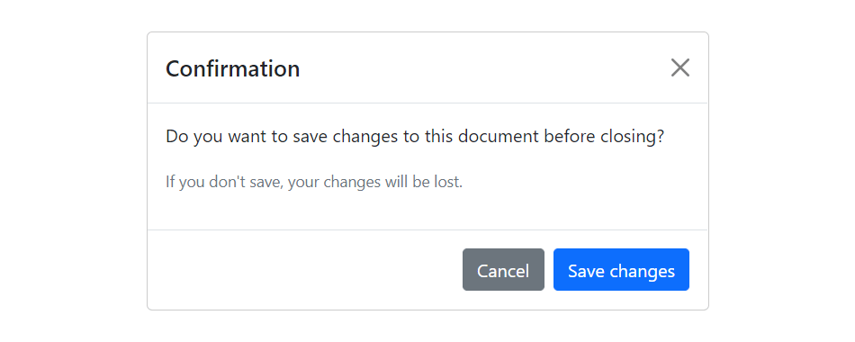
Modal is basically a dialog box or popup window that is used to provide important information to the user or prompt user to take necessary actions before moving on. Modals are widely used to warn users for situations like session time out or to receive their final confirmation before going to perform any critical actions such as saving or deleting important data.
You can easily create very smart and flexible dialog boxes with the Bootstrap modal plugin. The following example oulines the basic structure to create a simple modal with a header, message body and the footer containing action buttons for the user.
Example
jQuery JavaScript
<!-- jQuery Code (to Show Modal on Page Load) -->
<script>
$(document).ready(function() {
    $("#myModal").modal("show");
});
</script>

<!-- Modal HTML -->
<div id="myModal" class="modal fade" tabindex="-1">
    <div class="modal-dialog">
        <div class="modal-content">
            <div class="modal-header">
                <h5 class="modal-title">Confirmation</h5>
                <button type="button" class="btn-close" data-bs-dismiss="modal"></button>
            </div>
            <div class="modal-body">
                <p>Do you want to save changes to this document before closing?</p>
                <p class="text-secondary"><small>If you don't save, your changes will be lost.</small></p>
            </div>
            <div class="modal-footer">
                <button type="button" class="btn btn-secondary" data-bs-dismiss="modal">Cancel</button>
                <button type="button" class="btn btn-primary">Save changes</button>
            </div>
        </div>
    </div>
</div>
— If you try out the above example, it will launches the modal window automatically when the DOM is fully loaded via JavaScript. The output will look something like this:
The utility class consists of a set of methods for implementing Backbone utility. Following are two methods that can be used to manipulate the Backbone.js utility:
1) Backbone.noConflict: It returns the Backbone objects back to its original value and provides a facility to store reference to a backbone. It can be used to embed backbone on third-party websites, where you don’t want to thrash the existing backbone.
var localBackbone = Backbone.noConflict();
var model = localBackbone.Model.extend(…);
2) Backbone.$: This property is used when you have multiple copies of jQuery on the page, or simply want to tell Backbone to use a particular object as its DOM / Ajax library.
The Backbone.js Views specify how your data looks like. They represent model’s data to the users. They can be used with any JavaScript template library. They handle users input events, bind events and methods, render model and collection and interact with users.
Following is a list of methods that can be used to manipulate the Backbone.js views:


