WordPress tutorial provides basic and advanced concepts of WordPress. Our WordPress tutorial is designed for beginners and professionals.
WordPress is an open-source CMS (Content Management System) which is based on PHP and MySQL.
Our WordPress tutorial includes all topics of WordPress such as installation, creating WordPress site, working on WordPress dashboard, creating and editing posts, pages and comments, working with themes and plugins, WordPress security, how to backup WordPress, optimizing WordPress performance etc.
The toast component is newly introduced in Bootstrap 4. They are lightweight notifications similar to push notifications that are shown by web browsers on computer screens. They’re built with flexbox, so you can easily align and position them on a web page.
Additionally, toasts are opt-in for performance reasons, so you must initialize them yourself with toast() method. Also, toasts will automatically hide after 5000 milliseconds (5 seconds), if you do not specify autohide: false option. Now let’s see how to create a toast.
Step 1: Adding the Toast Markup
Toasts markups are pretty straightforward. The following example will show you how to create a toast component with a header, body, and a close button.
<div class="toast" id="myToast">
    <div class="toast-header">
        <strong class="me-auto"><i class="bi-gift-fill"></i> We miss you!</strong>
        <small>10 mins ago</small>
        <button type="button" class="btn-close" data-bs-dismiss="toast"></button>
    </div>
    <div class="toast-body">
        It's been a long time since you visited us. We've something special for you. <a href="#">Click here!</a>
    </div>
</div>
Step 2: Triggering the Toasts
Toasts can be triggered via JavaScript — just call the toast() Bootstrap method with the id, class or any CSS selector of the target element in your JavaScript code.
<div class="toast bg-primary text-white fade show">
    <div class="toast-header bg-primary text-white">
        <strong class="me-auto"><i class="bi-gift-fill"></i> We miss you!</strong>
        <small>10 mins ago</small>
        <button type="button" class="btn-close btn-close-white" data-bs-dismiss="toast"></button>
    </div>
    <div class="toast-body">
        It's been a long time since you visited us. We've something special for you. <a href="#" class="text-white">Click here!</a>
    </div>
</div>
— The output of the above example will look something like this:
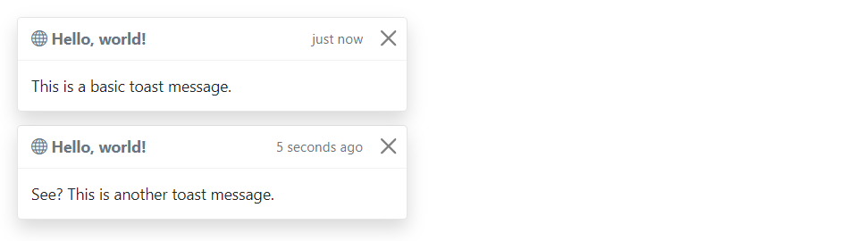
Stacking Toasts Vertically
You can stack multiple toasts vertically by simply wrapping them in a toast container, which will vertically add some spacing. Let’s take a look at the following example:
<div class="toast-container">
    <div class="toast fade show">
        <div class="toast-header">
            <strong class="me-auto"><i class="bi-globe"></i> Hello, world!</strong>
            <small>just now</small>
            <button type="button" class="btn-close" data-bs-dismiss="toast"></button>
        </div>
        <div class="toast-body">
            This is a basic toast message.
        </div>
    </div>

    <div class="toast fade show">
        <div class="toast-header">
            <strong class="me-auto"><i class="bi-globe"></i> Hello, world!</strong>
            <small>5 seconds ago</small>
            <button type="button" class="btn-close" data-bs-dismiss="toast"></button>
        </div>
        <div class="toast-body">
            See? This is another toast message.
        </div>
    </div>
</div>
— The output of the above example will look something like this:
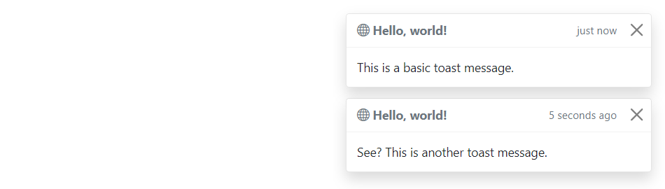
Placement of Toasts
You can place toasts anywhere on your web page using custom CSS positioning. However, the top right, bottom right, or top middle side is recommended for notifications.
Also, if you only want to show one toast at a time, put the positioning styles inline (i.e. directly on the .toast element). Let’s try out an example and see how it works:
— The output of the above example will look something like this:
Options
There are certain options which can be passed to toast() Bootstrap method to customize the functionality of a toast. Options can be passed via data attributes or JavaScript.
For setting the toast options via data attributes, just append the option name to data-bs-, such as data-bs-autohide="false", data-bs-delay="3000", etc.
Name
Type
Default Value
Description
animation
boolean
true
Apply a CSS fade transition to the toast.
autohide
boolean
true
Auto hide the toast.
delay
number
5000
Delay hiding the toast (ms).
Data attributes provides an easy way for setting the toast options, however JavaScript is the more preferable way as it prevents you from repetitive work. See the passing options examples in the methods section below to know how to set the options for toasts using JavaScript.
In the following example we’ve set the autohide option to false using the data attribute (line no-1) which prevents the toast from closing automatically.
<div class="toast" id="myToast" data-bs-autohide="false">
    <div class="toast-header">
        <strong class="me-auto"><i class="bi-gift-fill"></i> We miss you!</strong>
        <small>10 mins ago</small>
        <button type="button" class="btn-close" data-bs-dismiss="toast"></button>
    </div>
    <div class="toast-body">
        It's been a long time since you visited us. We've something special for you. <a href="#">Click here!</a>
    </div>
</div>
Methods
These are the standard bootstrap’s toast methods:
Passing options
You can additionally pass options to the toast using options object.
The following example code will prevent the toast from closing automatically.
This is a static method which allows you to get the toast instance associated with a DOM element, or create a new one in case if the toast wasn’t initialized.
Tip: Static methods cannot be called on instances of the class (i.e. objects). They’re called on the class itself. The keyword static is used to define a static method for a class.
Events
Bootstrap’s modal class includes few events for hooking into modal functionality.
Event
Description
show.bs.toast
This event fires immediately when the show instance method is called.
shown.bs.toast
This event is fired when the toast has been made visible to the user. It will wait until the CSS transition process has been fully completed before getting fired.
hide.bs.toast
This event is fired immediately when the hide instance method has been called.
hidden.bs.toast
This event is fired when the toast has finished being hidden from the user. It will wait until the CSS transition process has been fully completed before getting fired.
The following example will display an alert message to the user when the fade out transition of the toast has been fully completed. Let’s try it out and see how it works:
The Bootstrap scrollspy is a navigation mechanism that automatically highlights the nav links based on the scroll position to indicate the visitor where they are currently on the page.
The scrollspy will make your web page more elegant and accessible, if you’re using the bookmark links for directing the visitors to the different sections of a page that has a huge amount of content.
Scrollspy has the following requirements to function properly:
It must be used on a Bootstrap nav, or list group component.
You must apply the style position: relative; on the element you’re spying on, which is usually the <body> element. But, if you’re spying a <div> or any element other than the <body> be sure to additionally apply a height and overflow-y: scroll; on it.
Anchors (<a>) are required and must point to an element with that id.
Here’s an example of a scrollspy using the list group. Let’s try it out and see how it works:
You can easily add scrollspy behavior to your navbar via data attributes without writing a single line of JavaScript code. Let’s try out the following example to see how it works:
You might be wondering what this code was all about. Well, let’s go through each part of this scrollspy example code one by one for a better understanding.
Explanation of Code
The Bootstrap scrollspy has basically two components — the target (e.g. nav or list group) and the scrollable area to spy on, which is often the <body> section.
The data-bs-spy="scroll" attribute (line no-01) is applied to the element you want to spy on, which is simply the <body> element in our case.
The data-bs-target attribute is added to the element we’re spying on (i.e. the <body> element) with the ID or class of the parent element of any Bootstrap .nav component, so that nav links can be targeted by the scrollspy for highlighting purpose.
The optional data-bs-offset attribute specifies the number of pixels to offset from top when calculating the position of scroll. Adjust the offset value if the targeted links are highlighting too early or too late. The default value is 10 pixels.
Rest of the thing is self explanatory, such as the .navbar element specifies a Bootstrap navbar, whereas the element <a href="#section1">Section 1</a> (line no-7) creates a bookmark link, the .dropdown element (line no-15) creates a dropdown menu, and so on.
Creating ScrollSpy via JavaScript
You may also add scrollspy manually using the JavaScript — just call the scrollspy() Bootstrap method with the id or classselector of the navbar in your JavaScript code.
There are certain options which may be passed to scrollspy() Bootstrap method to customize the functionality of a scrollspy. Options can be passed via data attributes or JavaScript.
For setting the scrollspy options via data attributes, just append the option name to data-bs-, like data-bs-offset="0", data-bs-method="position", and so on.
Name
Type
Default Value
Description
offset
number
10
Number of pixels to offset from top when calculating position of scroll.
method
string
auto
Finds which section the spied element is in. The value auto will choose the best method get scroll coordinates.Whereas, the value offset will use jQuery offset method to get scroll coordinates, and the value position will use jQuery position method to get scroll coordinates.
target
string | jQuery object | DOM element
Specifies element to apply Scrollspy plugin.
Methods
These are the standard bootstrap’s scrollspy methods:
Passing options
You can additionally pass options to the scrollspy using options object.
The following example will set offset from top when calculating scroll position.
You’ll need to call this method when you’re using scrollspy in conjunction with adding or removing elements from the DOM. Let’s try out an example and see how it really works:
This is a static method which allows you to get the scrollspy instance associated with a DOM element, or create a new one in case if the scrollspy wasn’t initialized.
The typeahead input fields are very popular in modern web forms. The main purpose of using typeahead is to improve the user experience by supplying hints or a list of possible choices based on the text they’ve entered while filling a form or searching something — like the Google instant search.
Typeahead functionality also saves time and reduces the number of potential errors, because the user has less likelihood of making a spelling mistake. Typeahead plugin has been dropped from the Bootstrap (v3.0+), in favor of using Twitter typeahead.
Twitter typeaheads is a fast and fully-featured autocomplete library inspired by twitter.com’s autocomplete search functionality. To create Twitter typeaheads first download typeahead.js from their official page — https://twitter.github.io/typeahead.js/ and include in your project, after that you can turn any text-based <input> element into a typeahead.
Twitter typeaheads require jQuery 1.9+ to work. Non-jQuery version is not available.
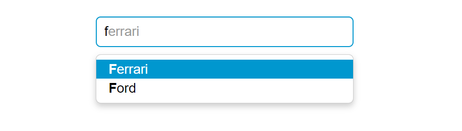
Creating Twitter Typeahead with Local Dataset
The following example will show you how to create Twitter typeahead with local dataset.
<script>
$(document).ready(function(){
    // Defining the local dataset
    var cars = ['Audi', 'BMW', 'Bugatti', 'Ferrari', 'Ford', 'Lamborghini', 'Mercedes Benz', 'Porsche', 'Rolls-Royce', 'Volkswagen'];

    // Constructing the suggestion engine
    var cars = new Bloodhound({
        datumTokenizer: Bloodhound.tokenizers.whitespace,
        queryTokenizer: Bloodhound.tokenizers.whitespace,
        local: cars
    });

    // Initializing the typeahead
    $('.typeahead').typeahead({
        hint: true,
        highlight: true, /* Enable substring highlighting */
        minLength: 1 /* Specify minimum characters required for showing suggestions */
    },
    {
        name: 'cars',
        source: cars
    });
});
</script>
— The output of the above example will look something like this:
Note: Bloodhound is the typeahead.js suggestion engine. It is very flexible and offers advanced functionalities such as prefetching remote data, fast lookups through intelligent caching using the browser local storage, etc.
Tip: Set autocomplete="off" for the input box if you want to prevent default browser menus from appearing over the Bootstrap type-ahead dropdown.
Creating Twitter Typeahead External Dataset
You can also specify external dataset through a URL pointing to a JSON file containing an array of datums. The individual units that compose datasets are called datums.
<script>
$(document).ready(function(){
    // Sonstructs the suggestion engine
    var countries = new Bloodhound({
        datumTokenizer: Bloodhound.tokenizers.whitespace,
        queryTokenizer: Bloodhound.tokenizers.whitespace,
        // The url points to a json file that contains an array of country names
        prefetch: 'data/countries.json'
    });

    // Initializing the typeahead with remote dataset without highlighting
    $('.typeahead').typeahead(null, {
        name: 'countries',
        source: countries,
        limit: 10 /* Specify max number of suggestions to be displayed */
    });
});
</script>
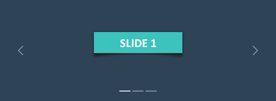
The carousel also known as slideshow or image slider is some of the best way of showcasing the huge amount of contents within a small space on the web pages. It is a dynamic presentation of contents where text and images are made visible or accessible to the user by cycling through several items.
The following example will show you how to build a simple carousel or slideshow with previous/next controls and indicators using the Bootstrap carousel plugin.
— The output of the above example will look something like this:
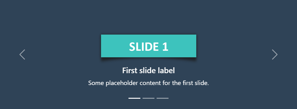
Creating Carousel with Captions
You can also add captions to carousel slides easily with the .carousel-caption element within any .carousel-item. You can optionally use display utility classes to hide captions on smaller viewports.
Let’s try out the following example to understand how it basically works:
— The output of the above example will look something like this:
Tip: The classes .d-none and .d-md-block on the .carousel-caption elements in the example above makes the carousel captions visible on the medium devices (i.e. viewport width ≥768px), but hide them on the smaller viewports.
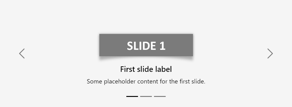
Creating Dark Variant of Carousel
You can additionally add .carousel-dark to the .carousel to create darker controls, indicators, and captions in case your slides are lighter in color. Let’s check out an example:
You can also add captions such as heading or description text to the individual slides of the carousel, please check out the next example in the following section.
Activate Carousels via Data Attributes
With Bootstrap you can create carousels very easily via data attributes without writing a single line of JavaScript code. Let’s take a look at the following example:
You might be wondering what this code was all about. Well, let’s go through each part of this carousel example code one by one for a better understanding.
Explanation of Code
The Bootstrap carousel generally has three components — carousel indicators (small rectangles), carousel controls (previous and next arrows) and the carousel items or slides.
The outermost container of every carousel (i.e. the .carousel element) requires a unique id (in our case id="myCarousel") so that it can be targeted by the carousel indicators (line no-4,5,6) and carousel controls (line no-23,26) to function properly.
The data-bs-ride="carousel" attribute of the .carousel element tells the Bootstrap to start animating the carousel immediately when the page load.
The data-bs-slide-to attribute (line no-4,5,6) move the slide position to a particular item (index beginning with 0) when clicking on the specific carousel indicator.
The slides are specified within the .carousel-inner (line no-10) and the content of each slide is defined within the .carousel-item element that can be text and images.
The data-bs-slide attribute on carousel controls (line no-23,26) accepts the keywords prev or next, which alters the slide position relative to its current position.
Rest of the thing is self-explanatory, for example, the .carousel element specifies the Bootstrap carousel, the .carousel-indicators element indicates how many slides are there in the carousel and which slide is currently active, .carousel-control-prev, .carousel-control-next elements defines previous and next controls to move between carousel slides, and so on.
Tip: It is required to add the class .active to one of the carousel slides (i.e. on the .carousel-item element), otherwise carousel will not be visible.
Note: The .slide class on the .carousel element adds CSS slide transition animation to the carousel that makes the carousel items slide when showing the new item.
Activate Carousels via JavaScript
You may also activate a carousel manually using the JavaScript — just call the carousel() method with the id or classselector of the wrapper element in your JavaScript code.
Tip: Manually activating a carousel via JavaScript can be helpful in a situation when you don’t want your carousel to start sliding or animating at page load.
Options
There are certain options which can be passed to carousel() Bootstrap method to customize the functionality of a carousel. Options can be passed via data attributes or JavaScript.
For setting the modals options via data attributes, just append the option name to data-bs, such as data-bs-interval="3000", data-bs-pause="hover", and so on.
Name
Type
Default Value
Description
interval
number
5000
Specifies the amount of time to delay (in milliseconds) between one slide to another in automatic cycling. If false, carousel will not automatically cycle.
keyboard
boolean
true
Specifies whether the carousel should react to keyboard events. By default it is true that means if carousel has focus you can go to its previous and next slide using the left and right arrow keys on the keyboard.
pause
string | boolean
‘hover’
Pauses the cycling of the carousel when mouse pointer enters the carousel and resumes the cycling when mouse pointer leaves the carousel, by default. If set to false, hovering over the carousel won’t pause it.
ride
string | boolean
false
Autoplays the carousel after the user manually cycles the first item. If set to 'carousel', autoplays the carousel on load.
wrap
boolean
true
Specifies whether the carousel should cycle continuously or have hard stops (i.e stop at the last slide).
touch
boolean
true
Specifies whether the carousel should support left/right swipe interactions on touchscreen devices.
Data attributes provides an easy way for setting the carousel options, however JavaScript is the more preferable way as it prevents you from repetitive work. See the passing options section below to know how to set the options for carousels using JavaScript.
Methods
These are the standard bootstrap’s carousels methods:
Passing options
You can additionally pass options to the carousels using options object.
The following example will turn off auto sliding in the carousel. By default Bootstrap carousel is started playing or sliding automatically when the page loads.
This is a static method which allows you to get the carousel instance associated with a DOM element, or create a new one in case if the carousel wasn’t initialized.
Bootstrap’s carousel class includes few events for hooking into carousel functionality.
Event
Description
slide.bs.carousel
This event fires immediately when the slide instance method is called.
slid.bs.carousel
This event is fired when the carousel has completed its slide transition.
The following example displays an alert message when sliding transition of a carousel item has been fully completed. Let’s try it out and see how it actually works.
In the previous section you’ve learnt about the Bootstrap button styling and the modifications as well as how to create button groups and toolbars. With Bootstrap you can do even more with the buttons like controlling the states of buttons, make checkbox and radio inputs behaves like toggle buttons, and so on. In the following section we will discuss them in detail.
Creating Single Toggle Button
You can activate toggling (i.e. change the normal state of a button to a push state and vice versa) on a single button by simply adding the data attribute data-bs-toggle="button".
If you’re pre-toggling a button, you must add the .active class manually.
— The toggle button upon clicking will look something like this:
Note: The Mozilla Firefox browser persists the button state across page loads, to prevent this behavior, you may simply set the attribute autocomplete="off" on the form containing the buttons, or directly to the input or button element.
Creating Checkbox Button Groups
You can also combine checkboxes to create checkbox style toggling on button groups. Let’s try out the following example to understand how it basically works:
— The output of the above example will look something like this:
Note: Don’t use the .active class to preselect checkbox or radio in button groups, as it only changes the visual appearance to make them look like selected. To actually preselect them you will need to apply the checked attribute on the input element yourself.
Creating Radio Button Groups
Similarly, you can create radio buttons style toggling on button groups, like this:
— The output of the above example will look something like this:
Methods
These are the standard bootstrap’s buttons methods:
toggle
This method toggles push state of the button. It changes the appearance of the button, and makes it look like that it has been activated. You can also enable auto toggling of a button by simply using the data-bs-toggle="button" attribute. Let’s take a look at the following example:
This is a static method which allows you to get the button instance associated with a DOM element, or create a new one in case if the button wasn’t initialized.
Alert boxes are used quite often to stand out the information that requires immediate attention of the end users such as warning, error or confirmation messages.
With Bootstrap you can easily create elegant alert messages for various purposes by adding the contextual classes (e.g., .alert-success, .alert-warning, .alert-info etc.) to the .alert base class. You can also add an optional close button to dismiss any alert.
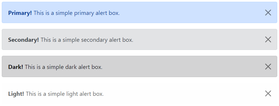
Bootstrap provides total 8 different types of alerts. The following example will show you the most commonly used alerts, which are: success, error or danger, warning and info alerts.
<!-- Primary Alert -->
<div class="alert alert-primary alert-dismissible fade show">
    <strong>Primary!</strong> This is a simple primary alert box.
    <button type="button" class="btn-close" data-bs-dismiss="alert"></button>
</div>

<!-- Secondary Alert -->
<div class="alert alert-secondary alert-dismissible fade show">
    <strong>Secondary!</strong> This is a simple secondary alert box.
    <button type="button" class="btn-close" data-bs-dismiss="alert"></button>
</div>

<!-- Dark Alert -->
<div class="alert alert-dark alert-dismissible fade show">
    <strong>Dark!</strong> This is a simple dark alert box.
    <button type="button" class="btn-close" data-bs-dismiss="alert"></button>
</div>

<!-- Light Alert -->
<div class="alert alert-light alert-dismissible fade show">
    <strong>Light!</strong> This is a simple light alert box.
    <button type="button" class="btn-close" data-bs-dismiss="alert"></button>
</div>
— The output of the above example will look something like this:
Tip: The .fade and .show classes on the .alert element enable the fading transition effect while closing the alert boxes. If you don’t want animation just removes these classes. Also, the class .alert-dismissible is required on the .alert element for proper positioning of the .btn-close. If your alert doesn’t have a close button you can skip this class.
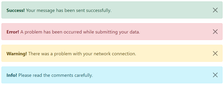
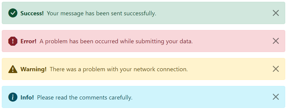
Adding Icons to Bootstrap Alerts
You can also place icons inside Bootstrap alerts. You can either use Bootstrap icons or third-party icons like Font Awesome. Let’s take a look at the following example:
<!-- Success Alert -->
<div class="alert alert-success alert-dismissible d-flex align-items-center fade show">
    <i class="bi-check-circle-fill"></i>
    <strong class="mx-2">Success!</strong> Your message has been sent successfully.
    <button type="button" class="btn-close" data-bs-dismiss="alert"></button>
</div>

<!-- Error Alert -->
<div class="alert alert-danger alert-dismissible d-flex align-items-center fade show">
    <i class="bi-exclamation-octagon-fill"></i>
    <strong class="mx-2">Error!</strong> A problem has been occurred while submitting your data.
    <button type="button" class="btn-close" data-bs-dismiss="alert"></button>
</div>

<!-- Warning Alert -->
<div class="alert alert-warning alert-dismissible d-flex align-items-center fade show">
    <i class="bi-exclamation-triangle-fill"></i>
    <strong class="mx-2">Warning!</strong> There was a problem with your network connection.
    <button type="button" class="btn-close" data-bs-dismiss="alert"></button>
</div>

<!-- Info Alert -->
<div class="alert alert-info alert-dismissible d-flex align-items-center fade show">
    <i class="bi-info-circle-fill"></i>
    <strong class="mx-2">Info!</strong> Please read the comments carefully.
    <button type="button" class="btn-close" data-bs-dismiss="alert"></button>
</div>
— The output of the above example will look something like this:
Additional Content inside Alerts
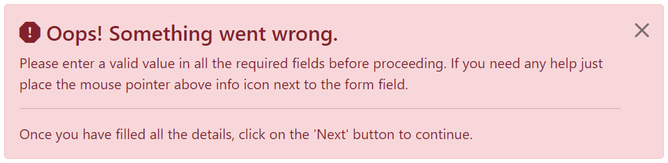
You can also place additional HTML elements like headings, paragraphs and dividers inside an alert. To manage spacing between the elements you can use margin utility classes, as here:
<div class="alert alert-danger alert-dismissible fade show">
    <h4 class="alert-heading"><i class="bi-exclamation-octagon-fill"></i> Oops! Something went wrong.</h4>
    <p>Please enter a valid value in all the required fields before proceeding. If you need any help just place the mouse pointer above info icon next to the form field.</p>
    <hr>
    <p class="mb-0">Once you have filled all the details, click on the 'Next' button to continue.</p>
    <button type="button" class="btn-close" data-bs-dismiss="alert"></button>
</div>
— The output of the above example will look something like this:
Matching Links Color inside Alerts
You can apply the utility class .alert-link to the links inside any alert boxes to quickly create matching colored links, as shown in the example below:
<!-- Success Alert -->
<div class="alert alert-success alert-dismissible fade show">
<strong>Success!</strong> A simple success alert with <a href="#" class="alert-link">an example link</a>.
<button type="button" class="btn-close" data-bs-dismiss="alert"></button>
</div>
<!-- Error Alert -->
<div class="alert alert-danger alert-dismissible fade show">
<strong>Error!</strong> A simple danger alert with <a href="#" class="alert-link">an example link</a>.
<button type="button" class="btn-close" data-bs-dismiss="alert"></button>
</div>
<!-- Warning Alert -->
<div class="alert alert-warning alert-dismissible fade show">
    <strong>Warning!</strong> A simple warning alert with <a href="#" class="alert-link">an example link</a>.
    <button type="button" class="btn-close" data-bs-dismiss="alert"></button>
</div>
<!-- Info Alert -->
<div class="alert alert-info alert-dismissible fade show">
<strong>Info!</strong> A simple info alert with <a href="#" class="alert-link">an example link</a>.
<button type="button" class="btn-close" data-bs-dismiss="alert"></button>
</div>
<!-- Primary Alert -->
<div class="alert alert-primary alert-dismissible fade show">
<strong>Primary!</strong> A simple primary alert with <a href="#" class="alert-link">an example link</a>.
<button type="button" class="btn-close" data-bs-dismiss="alert"></button>
</div>
<!-- Secondary Alert -->
<div class="alert alert-secondary alert-dismissible fade show">
<strong>Secondary!</strong> A simple secondary alert with <a href="#" class="alert-link">an example link</a>.
<button type="button" class="btn-close" data-bs-dismiss="alert"></button>
</div>
<!-- Dark Alert -->
<div class="alert alert-dark alert-dismissible fade show">
<strong>Dark!</strong> A simple dark alert with <a href="#" class="alert-link">an example link</a>.
<button type="button" class="btn-close" data-bs-dismiss="alert"></button>
</div>
<!-- Light Alert -->
<div class="alert alert-light alert-dismissible fade show">
<strong>Light!</strong> A simple light alert with <a href="#" class="alert-link">an example link</a>.
<button type="button" class="btn-close" data-bs-dismiss="alert"></button>
</div>
Closing Alerts via Data Attribute
Data attributes provides a simple and easy way to add close functionality to the alert boxes.
Just add the data-bs-dismiss="alert" to the close button and it will automatically enable the dismissal of the containing alert message box. Also, add the class .alert-dismissible to the .alert element for proper positioning of the .btn-close button.
<div class="alert alert-info alert-dismissible fade show">
    <strong>Note!</strong> This is a simple example of dismissible alert.
    <button type="button" class="btn-close" data-bs-dismiss="alert"></button>
</div>
Use the <button> element for creating the close button for consistent behavior across all devices.
Closing Alerts via JavaScript
You may also dismiss an alert via JavaScript. Let’s try out an example and see how it works:
These are the standard bootstrap’s alerts methods:
close
This method closes an alert by removing it from the DOM. If the .fade and .show classes are present on the element, the alert will fade out before it is removed.
<script>
$(document).ready(function(){
    // Create alert instance
    $("#myAlert").alert();

    // Get alert instance on button click
    $("#myBtn").click(function(){
        var myAlert = bootstrap.Alert.getInstance($("#myAlert")[0]);
        console.log(myAlert);
        // {_element: div#myAlert.alert.alert-info.alert-dismissible.fade.show}
    });
});
</script>
getOrCreateInstance
This is a static method which allows you to get the alert instance associated with a DOM element, or create a new one in case if the alert wasn’t initialized.
Popover is a small overlay of content that is used to display secondary information of any element when it is clicked by a user, like those on the iPad.
Step 1: Adding the Popover Markup
To create a popover, you need to add the data-bs-toggle="popover" attribute to an element. Whereas, popover’s title and its content that would display upon trigger or activation can be specified using the title and data-bs-content attribute respectively.
Here is the standard markup for adding a popover to a button.
<button type=”button” data-bs-toggle=”popover” title=”Popover title” data-bs-content=”Here’s some amazing content.”>Click to toggle popover</button>
Similarly, you can add popovers to the other elements such as links, icons, etc.
Note: For performance reasons the popovers data-apis are opt in like tooltips, means to use popovers you must initialize them yourself. Also, popovers with zero-length title and content values are never displayed, as well as triggering popovers on hidden elements will not work.
Step 2: Enabling the Popovers
Popovers can be triggered via JavaScript — just call the popover() Bootstrap method with the id, class or any CSS selector of the required element in your JavaScript code.
You can either initialize popovers individually or all in one go. The following example code will initialize all popovers on the page by selecting them by their data-bs-toggle attribute.
By default popovers are not hiding until you click the trigger element once again. You can use the focus trigger to hide the popovers when the user makes the next click.
Note: To make this feature work properly across the browsers, you must use the <a> tag, not the <button> tag, and you also must include a tabindex attribute.
Options
There are certain options which may be passed to popover() Bootstrap method to customize the functionality of the popover plugin.
Name
Type
Default Value
Description
animation
boolean
true
Apply a CSS fade transition to the popover.
container
string | element | false
false
Appends the popover to a specific element.Specify container: 'body' to avoid rendering problems in more complex components (like input groups, button groups, etc.)
content
string | element | function
”
Sets default content value if data-bs-content attribute isn’t present.
delay
number | object
0
Time to delay in showing and hiding the popover (ms) — does not apply to manual trigger type.If a number is supplied, delay is applied to both hide/showObject structure is: delay: { "show": 500, "hide": 100 }
html
boolean
false
Insert HTML into the popover.If false, innerText property will be used to insert content into the DOM.Use simple text if you’re worried about XSS attacks.
placement
string | function
‘right’
Sets the position of the popover — auto | top | bottom | left | right.When auto value is specified, it will dynamically reorient the popover.
selector
string | false
false
If a selector is provided, popover objects will be attached to the specified targets.This is normally used to apply popovers to dynamically added DOM elements.
Base HTML to use when creating the popover.The popover’s title will be inserted into the .popover-header element.The popover’s content will be inserted into the .popover-body element.The .popover-arrow element will become the popover’s arrow.The outermost wrapper element should have the .popover class.
title
string | element | function
”
Sets the default title value if title attribute isn’t present.
trigger
string
‘click’
Specify how popover is triggered — click | hover | focus | manual. You can pass multiple triggers; separated with a space.The value manual indicates that the popover will be triggered programmatically via the .show(), .hide() and .toggle() methods; this value cannot be combined with any other trigger.
fallbackPlacements
array
[‘top’, ‘right’, ‘bottom’, ‘left’]
Allows you to specify which placement Popper will use on fallback.
boundary
string | element
‘clippingParents’
Overflow constraint boundary of the popover (applies only to Popper’s preventOverflow modifier). It can also accept an HTMLElement reference (via JavaScript only).
customClass
string | function
”
Add classes to the popover when it is shown. Please note that these classes will be added in addition to any classes specified in the template. To add multiple classes, separate them with spaces like: 'class1 class2'.You can also pass a function that should return a single string containing additional class names.
sanitize
boolean
true
Enable or disable the sanitization. If activated 'template', 'content' and 'title' options will be sanitized.
You can set these options either through the use of data attributes or JavaScript. For setting the popovers options via data attributes, just append the option name to data-bs- along with the correct value, like data-bs-animation="false", data-bs-placement="top" etc.
Also, when passing the options via data attributes make sure to change the case type of the option name from camelCase to kebab-case. For example, instead of using data-bs-customClass="my-class", use data-bs-custom-class="my-class".
However, JavaScript is the preferred way of setting these options as it prevents you from repetitive work. See the passing options section below to know how to set the options for popovers via JavaScript.
Methods
These are the standard Bootstrap’s popover methods:
Passing options
You can additionally pass options to the popovers using options object.
The following example will set the title text for the popovers dynamically, if the value of the title attribute is omitted or missing from the selected elements:
<script>
$(document).ready(function(){
    $("#myPopover").popover({
        title: '<h4 class="custom-title"><i class="bi-info-circle-fill"></i> Popover info</h4>',
        content: '<p>This is a <em>simple example</em> demonstrating how to insert HTML code inside <strong>Bootstrap popover</strong>.</p>',
        html: true
    });
});
</script>
The following example will show you how to control the timing of showing and hiding the popover using the popover’s delay option dynamically via JavaScript.
<script>
$(document).ready(function(){
    // Show and hide popover with same speed
    $("#tinyPopover").popover({
        delay: 100
    });

    // Show and hide popover with different speed
    $("#largePopover").popover({
        delay: {show: 0, hide: 2000}
    });
});
</script>
The following example will show you how to create your own custom template for Bootstrap popovers instead of using the default one dynamically via JavaScript.
The following example will insert the dynamically generated HTML code of the popover at the end of the #wrapper element instead of the default <body> element.
<script>
$(document).ready(function(){
    // Append popover HTML to wrapper element
    $("#myPopover").popover({
        container: "#wrapper"
    });
});
</script>
Note: Overriding the popover’s default container option value does not produce any visible difference on page. To see the actual result you need to inspect the DOM. Press Ctrl+Shift+I (Windows / Linux) or Cmd+Opt+I (Mac) to open Developer tools or DOM Inspector.
Similarly, you can set other options for the popovers. Let’s check out the other methods of the Bootstrap popover plugin.
show
This method reveals an element’s popover. This is considered a “manual” triggering of the popover.
<script>
$(document).ready(function(){
    // Trigger the popover
    $("#myPopover").popover();

    // Get popover instance on button click
    $("#myBtn").click(function(){
        var myPopover = bootstrap.Popover.getInstance($("#myPopover")[0]);
        console.log(myPopover);
        // {_element: button#myPopover.btn.btn-primary.btn-lg, _isEnabled: true, _timeout: 0, _hoverState: null, _activeTrigger: {…}, …}
    });
});
</script>
getOrCreateInstance
This is a static method which allows you to get the popover instance associated with a DOM element, or create a new one in case if the popover wasn’t initialized.
<script>
$(document).ready(function(){
    // Get or create popover instance on button click
    $("#myBtn").click(function(){
        var myPopover = bootstrap.Popover.getOrCreateInstance($("#myPopover")[0]);
        console.log(myPopover);
        // {_element: button#myPopover.btn.btn-primary.btn-lg, _isEnabled: true, _timeout: 0, _hoverState: "", _activeTrigger: {…}, …}
    });
});
</script>
Events
Bootstrap’s popover class includes few events for hooking into popover functionality.
Event
Description
show.bs.popover
This event fires immediately when the show instance method is called.
shown.bs.popover
This event is fired when the popover has been made visible to the user. It will wait until the CSS transition process has been fully completed before getting fired.
hide.bs.popover
This event is fired immediately when the hide instance method has been called.
hidden.bs.popover
This event is fired when the popover has finished being hidden from the user. It will wait until the CSS transition process has been fully completed before getting fired.
inserted.bs.popover
This event is fired after the show.bs.popover event when the popover template has been added to the DOM.
The following example will display an alert message to the user when the fade out transition of the popover has been fully completed.
<script>
$(document).ready(function(){
    // Initialize popover
    $("#myPopover").popover();

    // Show alert when the popover has finished being hidden
    $("#myPopover").on("hidden.bs.popover", function(){
        alert("Popover has been completely closed.");
    });
});
</script>
A tooltip is a small pop up that appears when user places the mouse pointer over an element such as link or buttons to provide hint or information about the element being hovered.
Tooltips can be very helpful for the new visitors of your website because they enable the user to know the purpose of icons and links by placing the mouse pointer over them.
Step 1: Adding the Tooltip Markup
To create a tooltip, you need to add the data-bs-toggle="tooltip" attribute to an element. Tolltip text that would display on hover can be specified using the title attribute.
Here is the standard markup for adding a tolltip to a hyperlink.
<a href=”#” data-bs-toggle=”tooltip” title=”Some text”>Hover over me</a>
Similarly, you can add tooltips to the other elements such as buttons, icons, etc.
Step 2: Enabling the Tooltips
Tooltips can be enabled via JavaScript — just call the tooltip() Bootstrap method with the id, class or any CSS selector of the target element in your JavaScript code.
You can either initialize tooltips individually or all in one go. The following jQuery code will initialize all tooltips on the page by selecting them by their data-bs-toggle attribute.
— The output of the above example will look something like this:
Note: For performance reasons the tooltip data-apis are opt in, means to use tooltips you must initialize them yourself. Also, tooltips with zero-length titles are never displayed, as well as triggering tooltips on hidden elements will not work.
Tip: Tooltips for .disabled or disabled elements must be triggered on a wrapper element. Also, when tooltips are triggered from hyperlinks that span multiple lines, it will be centered. You can use white-space: nowrap; on those hyperlinks to avoid this behavior.
Setting the Directions of Tooltips
You can set tooltips to appear on top, right, bottom and left sides of an element.
Positioning of Tooltips via Data Attributes
The following example will show you how to set the direction of tooltips via data attributes.
<a href="#" data-bs-toggle="tooltip" data-bs-placement="top" title="Tooltip on top">Tooltip on top</a>
<a href="#" data-bs-toggle="tooltip" data-bs-placement="right" title="Tooltip on right">Tooltip on right</a>
<a href="#" data-bs-toggle="tooltip" data-bs-placement="bottom" title="Tooltip on bottom">Tooltip on bottom</a>
<a href="#" data-bs-toggle="tooltip" data-bs-placement="left" title="Tooltip on left">Tooltip on left</a>
Positioning of Tooltips via JavaScript
The following example will show you how to set the direction of tooltips via JavaScript.
There are certain options which may be passed to tooltip() Bootstrap method to customize the functionality of the tooltip plugin.
Name
Type
Default Value
Description
animation
boolean
true
Apply a CSS fade transition to the tooltip.
container
string | element | false
false
Appends the tooltip to a specific element.Specify container: 'body' to avoid rendering problems in more complex components (like input groups, button groups, etc.)
delay
number | object
0
Time to delay in showing and hiding the tooltip (ms) — does not apply to manual trigger type.If a number is supplied, delay is applied to both hide/showObject structure is: delay: { "show": 500, "hide": 100 }
html
boolean
false
Insert HTML into the tooltip.If true, HTML tags in the tooltip’s title will be rendered in the tooltip. If false, innerText property will be used to insert content into the DOM.Use simple text if you’re worried about XSS attacks.
placement
string | function
‘top’
Sets the position of the tooltip — auto | top | bottom | left | right.When auto value is specified, it will dynamically reorient the tooltip.
selector
string | false
false
If a selector is provided, tooltip objects will be attached to the specified targets.This is normally used to apply tooltips to dynamically added DOM elements.
Base HTML to use when creating the tooltip.The tooltip’s title will be inserted into the .tooltip-inner element.The .tooltip-arrow element will become the tooltip’s arrow.The outermost wrapper element should have the .tooltip class.
title
string | element | function
”
Sets the default title value if title attribute isn’t present.
trigger
string
‘hover focus’
Specify how tooltip is triggered — click | hover | focus | manual. You can pass multiple triggers; separated with a space.The value manual indicates that the tooltip will be triggered programmatically via the .show(), .hide() and .toggle() methods; this value cannot be combined with any other trigger.
fallbackPlacements
array
[‘top’, ‘right’, ‘bottom’, ‘left’]
Allows you to specify which placement Popper will use on fallback.
boundary
string | element
‘clippingParents’
Overflow constraint boundary of the tooltip (applies only to Popper’s preventOverflow modifier). It can also accept an HTMLElement reference (via JavaScript only).
customClass
string | function
”
Add classes to the tooltip when it is shown. Please note that these classes will be added in addition to any classes specified in the template. To add multiple classes, separate them with spaces like: 'class1 class2'.You can also pass a function that should return a single string containing additional class names.
sanitize
boolean
true
Enable or disable the sanitization. If activated 'template' and 'title' options will be sanitized.
You can set these options either through the use of data attributes or JavaScript. For setting the tooltips options via data attributes, just append the option name to data-bs- along with the correct value, like data-bs-animation="false", data-bs-placement="bottom" etc.
Also, when passing the options via data attributes make sure to change the case type of the option name from camelCase to kebab-case. For example, instead of using data-bs-customClass="my-class", use data-bs-custom-class="my-class".
However, JavaScript is the preferred way of setting these options as it prevents you from repetitive work. See the passing options section below to know how to set the options for tooltips via JavaScript.
Methods
These are the standard Bootstrap’s tooltip methods:
Passing options
You can additionally pass options to the tooltips using options object.
The following example will set the title text for the tooltips dynamically, if the value of the title attribute is omitted or missing from the selected elements:
The following example will show you how to control the timing of showing and hiding the tooltip using the tooltip’s delay option dynamically via JavaScript.
<script>
$(document).ready(function(){
    // Show and hide tooltip with same speed
    $("#tinyTooltip").tooltip({
        delay: 100
    });

    // Show and hide tooltip with different speed
    $("#largeTooltip").tooltip({
        delay: {show: 0, hide: 2000}
    });
});
</script>
The following example will show you how to create your own custom template for Bootstrap tooltips instead of using the default one dynamically via JavaScript.
The following example will insert the dynamically generated HTML code of the tooltip at the end of the #wrapper element instead of the default <body> element.
<script>
$(document).ready(function(){
    // Append tooltip HTML to wrapper element
    $("#myTooltip").tooltip({
        container: "#wrapper"
    });
});
</script>
Note: Overriding the tooltip’s default container option value does not produce any visible difference on page. To see the actual result you need to inspect the DOM. Press Ctrl+Shift+I (Windows / Linux) or Cmd+Opt+I (Mac) to open Developer tools or DOM Inspector.
Similarly, you can set other options for the tooltips. Let’s check out the other methods of the Bootstrap tooltip plugin.
show
This method reveals an element’s tooltip. This is considered a “manual” triggering of the tooltip.
<script>
$(document).ready(function(){
    // Trigger the tooltip
    $("#myTooltip").tooltip();

    // Get tooltip instance on button click
    $("#myBtn").click(function(){
        var myTooltip = bootstrap.Tooltip.getInstance($("#myTooltip")[0]);
        console.log(myTooltip);
        // {_element: a#myTooltip, _isEnabled: true, _timeout: 0, _hoverState: "", _activeTrigger: {…}, …}
    });
});
</script>
getOrCreateInstance
This is a static method which allows you to get the tooltip instance associated with a DOM element, or create a new one in case if the tooltip wasn’t initialized.
<script>
$(document).ready(function(){
    // Get or create tooltip instance on button click
    $("#myBtn").click(function(){
        var myTooltip = bootstrap.Tooltip.getOrCreateInstance($("#myTooltip")[0]);
        console.log(myTooltip);
        // {_element: a#myTooltip, _isEnabled: true, _timeout: 0, _hoverState: "", _activeTrigger: {…}, …}
    });
});
</script>
Events
Bootstrap’s tooltip class includes few events for hooking into tooltip functionality.
Event
Description
show.bs.tooltip
This event fires immediately when the show instance method is called.
shown.bs.tooltip
This event is fired when the tooltip has been made visible to the user. It will wait until the CSS transition process has been fully completed before getting fired.
hide.bs.tooltip
This event is fired immediately when the hide instance method has been called.
hidden.bs.tooltip
This event is fired when the tooltip has finished being hidden from the user. It will wait until the CSS transition process has been fully completed before getting fired.
inserted.bs.tooltip
This event is fired after the show.bs.tooltip event when the tooltip template has been added to the DOM.
The following example will display an alert message to the user when the fade out transition of the tooltip has been fully completed.
You can use the Bootstrap collapse JavaScript plugin to easily show and hide (or expand and collapse) specific elements on a web page. Buttons and anchors (i.e. the <button> and <a> elements) are typically used as triggers that are mapped to the elements you want to toggle.
Expand and Collapse Elements via Data Attributes
You can show and hide elements in Bootstrap by clicking on a button or link via data attributes without writing any JavaScript code. Let’s try out an example and see how it actually works:
<!-- Trigger Buttons HTML -->
<a href="#myCollapse" data-bs-toggle="collapse">Toggle Element</a>
<button type="button" class="btn btn-primary" data-bs-toggle="collapse" data-bs-target="#myCollapse">Toggle Element</button>

<!-- Collapsible Element HTML -->
<div class="collapse show" id="myCollapse">
    <div class="card card-body">This is a simple example of showing and hiding specific element via data attributes. Click any trigger buttons to toggle this panel.</div>
</div>
We’ve just created a collapsible control without writing any JavaScript code. Well, let’s go through each part of this code one by one for a better understanding.
Explanation of Code
The Bootstrap collapse plugin basically requires the two elements to work properly — the trigger element such as a button or hyperlink, and the collapsible element itself.
The data-bs-toggle="collapse" attribute is added to the trigger or controller element along with a attribute data-bs-target (for buttons) or href (for anchors) to automatically assign control of one or more collapsible elements.
The data-bs-target or href attribute accepts a CSS selector (such as id selector #myCollapse in our example) to apply the collapse to a specific element.
The class .collapse is added to the collapsible element (line no-6).
You can optionally add the class .show (line no-6) to the collapsible element in addition to the class .collapse to make it open by default.
To make the collapsible controls to work in group like accordion menu, you can utilize the Bootstrap card component. See the tutorial on Bootstrap accordion to learn more about it.
Expand and Collapse Elements via JavaScript
You may also expand and collapse elements manually via JavaScript — just call the collapse() Bootstrap method with the id or classselector of the collapsible element.
There are certain options which may be passed to the collapse() Bootstrap method to customize the functionality of a collapsible element.
Name
Type
Default Value
Description
parent
selector
false
All other collapsible elements under the specified parent will be closed while this collapsible item is shown on invocation.
toggle
boolean
true
Toggles the collapsible element on invocation.
You can also set these options using the data attributes on accordion — just append the option name to data-bs-, like data-bs-parent="#myAccordion", data-bs-toggle="false".
Methods
These are the standard bootstrap’s collapse methods:
Passing options
You can additionally pass options to the collapse using options object.
In following example the display of the collapsible element will not toggle on invocation, because the toggle option for the collapsible element is set to false.
This is a static method which allows you to get the collapse instance associated with a DOM element, or create a new one in case if the collapse wasn’t initialized.
Tip: Static methods cannot be called on instances of the class (i.e. objects). They’re called on the class itself. The keyword static is used to define a static method for a class.
Events
Bootstrap’s collapse class includes few events for hooking into collapse functionality.
Event
Description
show.bs.collapse
This event fires immediately when the show instance method is called.
shown.bs.collapse
This event is fired when a collapse element has been made visible to the user. It will wait until the CSS transition process has been fully completed before getting fired.
hide.bs.collapse
This event is fired immediately when the hide method has been called.
hidden.bs.collapse
This event is fired when a collapse element has been hidden from the user. It will wait until the CSS transition process has been fully completed before getting fired.
The following example displays an alert message to the user when sliding transition of a collapsible element has been fully completed.
<script>
$(document).ready(function(){
    $("#myCollapse").on("hidden.bs.collapse", function(){
        alert("Collapsible element has been completely closed.");
    });
});
</script>


