Tab based navigations provides a powerful mechanism to handle huge amount of content within a small area through separating content into different panes where each pane is viewable one at a time.
User can quickly access the content through switching between the panes without leaving the page. The following example will show you how to create the basic tabs using the Bootstrap tab component.
— The output of the above example will look something like this:
The tabs plugin also works with pills nav. To create pill nav just replace the class .nav-tabs with .nav-pills in the tab markup, as shown in the following example:
— The output of the above example will look something like this:
Creating Dynamic Tabs via Data Attributes
You can activate a tab or pill navigation without writing any JavaScript code — simply specify the data-bs-toggle="tab" on each tab, or data-bs-toggle="pill" on each pill, as well as create a .tab-pane with unique ID for every tab and wrap them in .tab-content.
Let’s take a look at an example to understand how to create dynamic tabs via data attributes.
Tip: The .fade class is added to each .tab-pane to make tabs fade in while showing new tab content. Also, you must add .active class to a .nav-link, as well as .show and .active classes to the corresponding .tab-pane to make it initially visible.
Creating Dynamic Tabs via JavaScript
You may also enable tabs via JavaScript. Each tab needs to be activated individually.
$('#myTab a[href="#profile"]').tab("show"); // show tab targeted by the selector
$("#myTab a:first").tab("show"); // show first tab
$("#myTab a:last").tab("show"); // show last tab
$("#myTab li:eq(1) a").tab("show"); // show second tab (0-indexed, like an array)
Methods
This is the standard bootstrap’s tab method:
show
Activates the given tab and shows its associated pane. Any other tab that was previously selected becomes unselected and its associated pane is hidden.
<script>
$(document).ready(function(){
    // Get tab instance on button click
    $("#myBtn").click(function(){
        var lastTab = bootstrap.Tab.getInstance($("#myTab a:first")[0]);
        console.log(lastTab);
        // {_element: a.nav-link.active}
    });
});
</script>
getOrCreateInstance
This is a static method which allows you to get the tab instance associated with a DOM element, or create a new one in case if the tab wasn’t initialized.
<script>
$(document).ready(function(){
    // Get or create tab instance on button click
    $("#myBtn").click(function(){
        var lastTab = bootstrap.Tab.getOrCreateInstance($("#myTab a:first")[0]);
        console.log(lastTab);
        // {_element: a.nav-link.active}
    });
});
</script>
Events
These are the standard Bootstrap events to enhance the tab functionality.
Event
Description
show.bs.tab
This event fires on tab show, but before the new tab has been shown. You can use the event.target and event.relatedTarget to target the active tab and the previous active tab (if available) respectively.
shown.bs.tab
This event fires on tab show after a tab has been shown. You can use the event.target and event.relatedTarget to target the active tab and the previous active tab (if available) respectively.
hide.bs.tab
This event fires when the current active tab is to be hidden and thus a new tab is to be shown. You can use the event.target and event.relatedTarget to target the current active tab and the new tab which is going to be active very soon, respectively.
hidden.bs.tab
This event fires after the previous active tab is hidden and a new tab is shown. You can use the event.target and event.relatedTarget to target the previous active tab and the new active tab, respectively.
The following example displays the names of active tab and previous tab to the user when transition of a tab has been fully completed.
The dropdown menu is typically used inside the navigation header to display a list of related links when a user mouse hover or click on the trigger element.
You can use the Bootstrap dropdown plugin to add toggleable dropdown menus (i.e. open and close on click) to almost anything such as links, buttons or button groups, navbar, tabs and pills nav etc. without even writing a single line of JavaScript code.
Adding Dropdowns via Data Attributes
Bootstrap provides an easy and elegant mechanism for adding the dropdown menu to an element via data attributes. The following example will show you the minimum markup required for adding a dropdown menu to the hyperlink via data attributes.
The above example demonstrates the most basic form of the Bootstrap dropdowns. Let’s understand each part of the Bootstrap dropdown component one by one.
Explanation of Code
The Bootstrap dropdown has basically two components — the dropdown trigger element which can be a hyperlink or button, and the dropdown menu itself.
The .dropdown class specifies a dropdown menu.
The .dropdown-toggle class defines the trigger element, which is a hyperlink in our case, whereas the attribute data-bs-toggle="dropdown" is required on the trigger element to toggle the dropdown menu.
The <div> element with the class .dropdown-menu is actually building the dropdown menu that typically contains the related links or actions.
Similarly, you can add the dropdowns to the buttons and nav components. The following section will show you some common implementation of the Bootstrap dropdown.
Dropdowns within a Navbar
The following examples will show you how to add dropdowns to navbar.
— Similarly you can add dropdowns to other variants of the buttons, as shown here:
Tip: You can use the Bootstrap’s button relative sizing classes like .btn-lg and .btn-sm on the .btn element to further resizing the buttons dropdowns.
Dropdowns Inside Button Groups
To create dropdown menus inside a button group just place a .btn-group along with the dropdown markup within another .btn-group, as shown in the following example:
You can even trigger the dropdown menus above, as well as, at the left and right of the elements by adding an extra class .dropup, .dropstart and .dropend, respectively to the parent element (i.e. the .btn-group element), as shown in the following example.
— The output of the above example will look something like this:
Creating the Right Aligned Dropdown Menus
By default, the top-left corner of the dropdown menu is positioned at the bottom-left corner of its parent element i.e. 100% from the top and along the left side. To right align the dropdown menu just add an extra class .dropdown-menu-end to the .dropdown-menu base class.
— The output of the above example will look something like this:
Adding Headers to Dropdown Items
You can optionally add a menu header to label a section of menu items inside a dropdown menu by adding the class .dropdown-header to the <div> element, like this:
You can apply the class .disabled to the menu items in the dropdown to make them look like disabled. However, the link is still clickable, to disable this you can typically remove the anchor’s href attribute either using the JavaScript or manually.
You may also add dropdowns manually using the JavaScript — just call the dropdown() Bootstrap method with the id or classselector of the link or button element in your JavaScript code.
Note: The data-bs-toggle="dropdown" is still required for the dropdown’s trigger element regardless of whether you call the dropdown via JavaScript or data-api.
Options
There are certain options which can be passed to dropdown() Bootstrap method to customize the functionality of a dropdown. Options can be passed via data attributes or JavaScript.
For setting the dropdown options via data attributes, just append the option name to data-bs-, like data-bs-display="static", and so on. Also, when passing the options via data attributes make sure to change the case type of the option name from camelCase to kebab-case. For example, instead of using data-bs-autoClose="false", use data-bs-auto-close="false".
Name
Type
Default Value
Description
boundary
string | element
‘clippingParents’
Overflow constraint boundary of the dropdown menu (applies only to Popper’s preventOverflow modifier). It can also accept an HTMLElement reference (via JavaScript only).
reference
string | element | object
‘toggle’
Reference element of the dropdown menu. Accepts the values of 'toggle', 'parent', an HTMLElement reference or an object providing getBoundingClientRect.
display
string
‘dynamic’
By default, Bootstrap use Popper for dynamic positioning. You can disable this with 'static'.
offset
array | string | function
[0, 2]
Specify the offset of the dropdown relative to its target. You can pass a string in data attributes with comma separated values like: data-bs-offset="10,20".
autoClose
boolean | string
true
Configure the auto close behavior of the dropdown:true – the dropdown will be closed by clicking outside or inside the dropdown menu.false – the dropdown will be closed by clicking the toggle button and manually calling the hide or toggle method. Also, dropdown will not be closed by pressing esc key.'inside' – the dropdown will be closed (only) by clicking inside the dropdown menu.'outside' – the dropdown will be closed (only) by clicking outside the dropdown menu.
This is a static method which allows you to get the dropdown instance associated with a DOM element, or create a new one in case if the dropdown wasn’t initialized.
These are the standard Bootstrap events to enhance the dropdown functionality.
All dropdown events are fired at the toggling element and then bubbled up. So you can also add event listeners on the .dropdown-menu‘s parent element. Also, you can use the event.relatedTarget to target the toggling anchor element.
Event
Description
show.bs.dropdown
This event fires immediately when the show instance method is called.
shown.bs.dropdown
This event is fired when the dropdown has been made visible to the user and CSS transitions have completed.
hide.bs.dropdown
This event is fired immediately when the hide instance method has been called.
hidden.bs.dropdown
This event is fired when the dropdown has finished being hidden from the user and CSS transitions have completed.
The following example displays the text content of dropdown link when the users click on it.
Example
jQuery JavaScript
<script>
$(document).ready(function(){
    $(".dropdown").on("show.bs.dropdown", function(e){
        var linkText = $(e.relatedTarget).text(); // Get the link text
        alert("Click on OK button to view the dropdown menu for - " + linkText);
    });
});
</script>
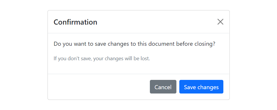
Modal is basically a dialog box or popup window that is used to provide important information to the user or prompt user to take necessary actions before moving on. Modals are widely used to warn users for situations like session time out or to receive their final confirmation before going to perform any critical actions such as saving or deleting important data.
You can easily create very smart and flexible dialog boxes with the Bootstrap modal plugin. The following example oulines the basic structure to create a simple modal with a header, message body and the footer containing action buttons for the user.
Example
jQuery JavaScript
<!-- jQuery Code (to Show Modal on Page Load) -->
<script>
$(document).ready(function() {
    $("#myModal").modal("show");
});
</script>

<!-- Modal HTML -->
<div id="myModal" class="modal fade" tabindex="-1">
    <div class="modal-dialog">
        <div class="modal-content">
            <div class="modal-header">
                <h5 class="modal-title">Confirmation</h5>
                <button type="button" class="btn-close" data-bs-dismiss="modal"></button>
            </div>
            <div class="modal-body">
                <p>Do you want to save changes to this document before closing?</p>
                <p class="text-secondary"><small>If you don't save, your changes will be lost.</small></p>
            </div>
            <div class="modal-footer">
                <button type="button" class="btn btn-secondary" data-bs-dismiss="modal">Cancel</button>
                <button type="button" class="btn btn-primary">Save changes</button>
            </div>
        </div>
    </div>
</div>
— If you try out the above example, it will launches the modal window automatically when the DOM is fully loaded via JavaScript. The output will look something like this:
The utility class consists of a set of methods for implementing Backbone utility. Following are two methods that can be used to manipulate the Backbone.js utility:
1) Backbone.noConflict: It returns the Backbone objects back to its original value and provides a facility to store reference to a backbone. It can be used to embed backbone on third-party websites, where you don’t want to thrash the existing backbone.
var localBackbone = Backbone.noConflict();
var model = localBackbone.Model.extend(…);
2) Backbone.$: This property is used when you have multiple copies of jQuery on the page, or simply want to tell Backbone to use a particular object as its DOM / Ajax library.
The Backbone.js Views specify how your data looks like. They represent model’s data to the users. They can be used with any JavaScript template library. They handle users input events, bind events and methods, render model and collection and interact with users.
Following is a list of methods that can be used to manipulate the Backbone.js views:
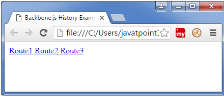
The backbone.js history serves as a global router, keeps track of the history, matches the appropriate route and triggers callbacks to handle events and enable routing in the application.
There is only method named “start” can be used to manipulate the Backbone.js history.
start:
The start method listens to routes and manages the history for bookmarkable URL’s. When all of your Routers have been created, and all of the routes are set up properly then Backbone.history.start() is called to begin monitoring the hashchange events, and dispatching routes.
Syntax:
Backbone.history.start(options)
Parameter explanation:
options: The “options” specifies the parameters like pushState and hashChange used with history.
Backbone.js Router is used for routing client side applications and connecting them to actions and events. It also defines the URL representation of application?s object when web applications provide linkable, bookmarkable, and sharable URL.
Following is list of methods which can be used to manipulate the Backbone.js router:
It is used to deal with a group of related models.
It handles the loading and saving of new models to the server.
It provides helper functions to perform aggregation and computation against a list of models.
You can create your own collection by extending the backbone’s collection class.
If an event is triggered on a model in a collection then this will also be triggered on the collection directly. It facilitates you to listen for changes to specific attributes in any model in a collection.
Following is a list of methods that can be used to manipulate the Backbone.js collection:
Backbone.js models are the most important building blocks used to build backbone.js applications. It is also known as the heart of the JavaScript application. Model contains dynamic data and its logic. It performs various types of action on the data like validation, conversion, computed properties, access control etc.
Following is a list of methods that can be used to manipulate the Backbone.js Model:
Backbone.js Events are the modules that can be mixed in to any object. It facilitates the objects to bind and trigger the custom events by using desired name of our choice.
Following is a list of methods that can be used to manipulate the Backbone.js Events:
It causes the listento occur only once before the callback function is being removed.
Backbone.js Built-in Events
Backbone.js facilitates you to use global events when it is needed in your application. It consist of some of the built-in events with arguments as shown in the below table:
Index
Event
Description
1.
“add”(model, collection, options)
It is used to add model to the collection.
2.
“remove”(model, collection, options)
It removes the model from the collection.
3.
“reset”(collection, options)
It is used to reset the collection contents.
4.
“sort”(collection, options)
It is used when collection needs to resorted.
5.
“change”(model, options)
It is used when changes occur in model?s attribute.
6.
“change:[attribute]”(model, value, options)
It is used when there is an update in an attribute.
7.
“destroy”(model, collection, options)
It fires when model is destroyed.
8.
“request”(model_or_collection, xhr, options)
It is used when model or collection starts requesting to the server.
9.
“sync”(model_or_collection, resp, options)
It is used when model or collection synced successfully with server.
10.
“error”(model_or_collection, resp, options)
It is activated when there is an error in requesting to the server.
11.
“invalid”(model, error, options)
It returns invalid when a failure occurs in model validation.
12.
“route:[name]”(params)
This event can be used when there is a specific rote match.
13.
“route”(route,params)
It is used when there is a match with any route.
14.
“route”(router, route, params)
It is used by history when there is a match with any route.
15.
“all”
It is used to fire for all triggered events by passing event name as first argument.